Abstract
Design Opportunity
The TU Delft student theses repository has not been updated since it switched to digital PDF reports in 2007. Currently, entries only contain a title, author and contributors, programme, date, abstract, and the PDF to download.
While the search engine is fine if you know the author's name or the title of the thesis you're looking for, users expressed that it's difficult to use the repository to find inspiration for your own graduation project, see what reports are good or not, or to find out what supervisors look for in a project, or what projects they usually take on.
After uploading, the entry looks boring, and doesn't grip the reader's attention. Furthermore, the entries are not very visible internally, or externally (like on google scholar) .
The goal
My goal was to redesign the repository to:
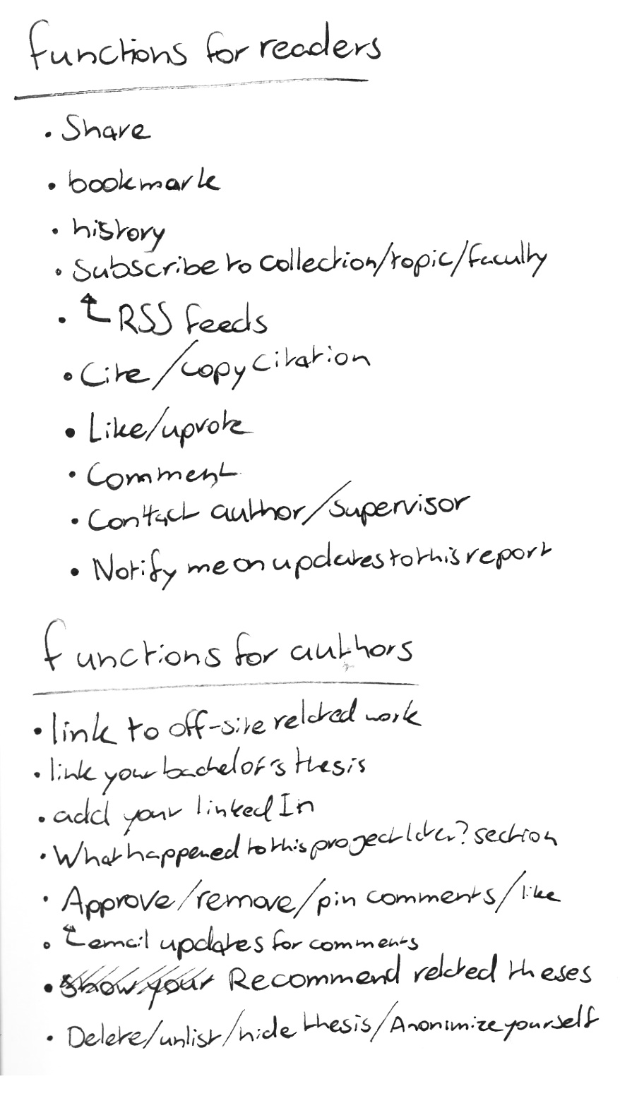
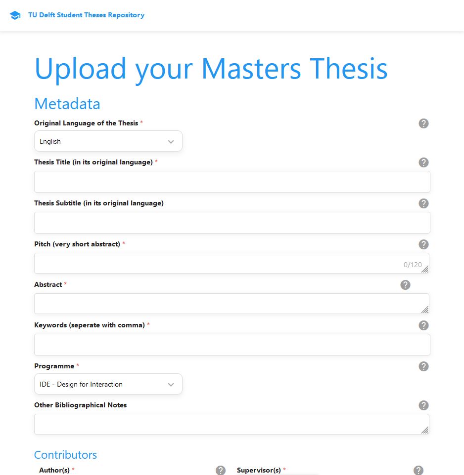
- ● Allow students to upload (interactive) multimedia to their repository pages.
- ● programmatically add multimedia to already uploaded repository pages.
- ● Redesign the user interface with a user centered design approach.
The solution
My new design features:
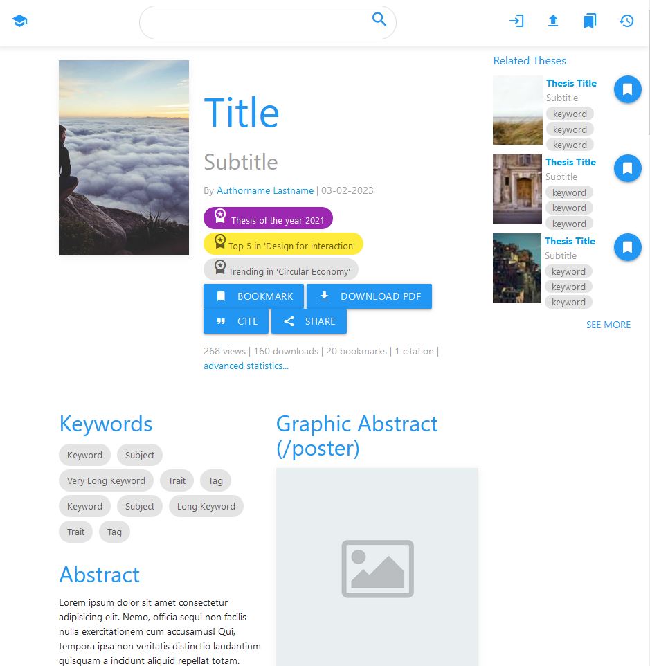
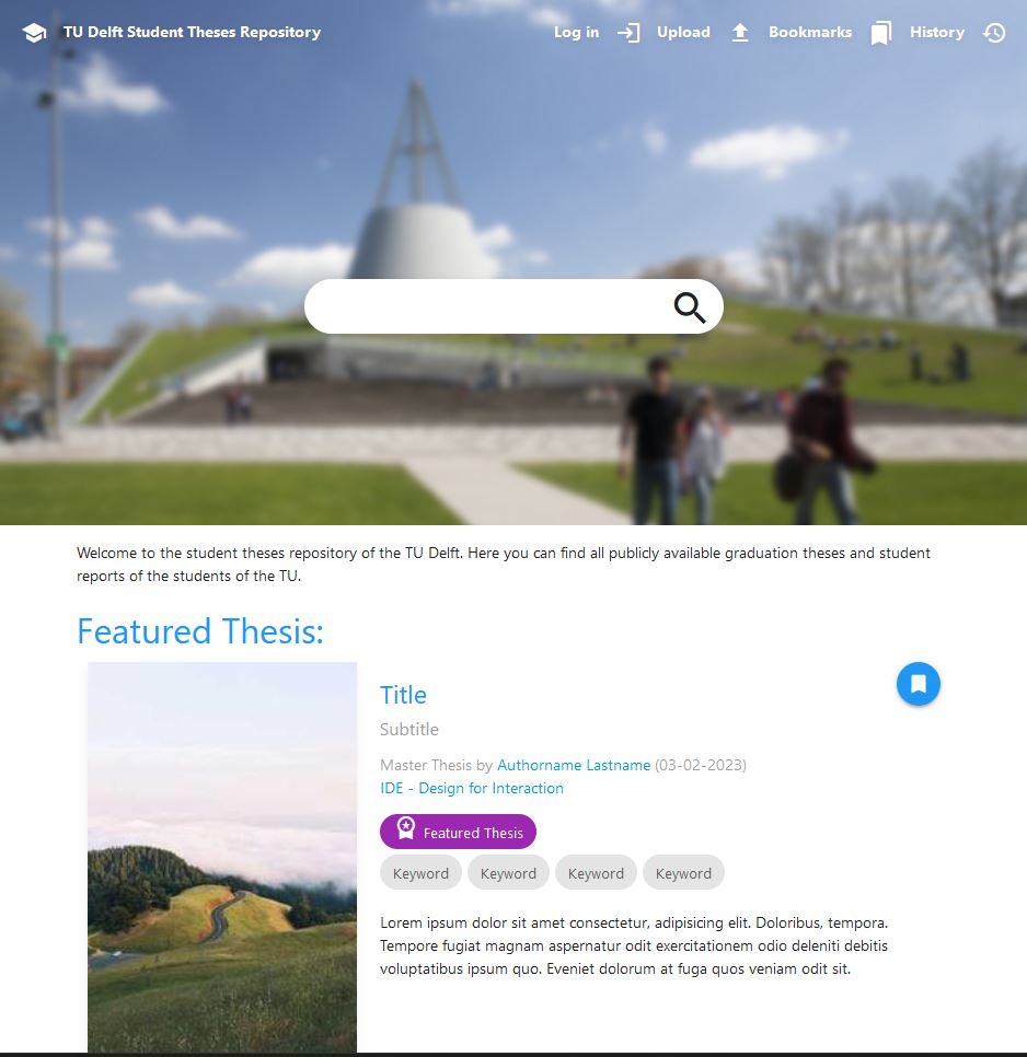
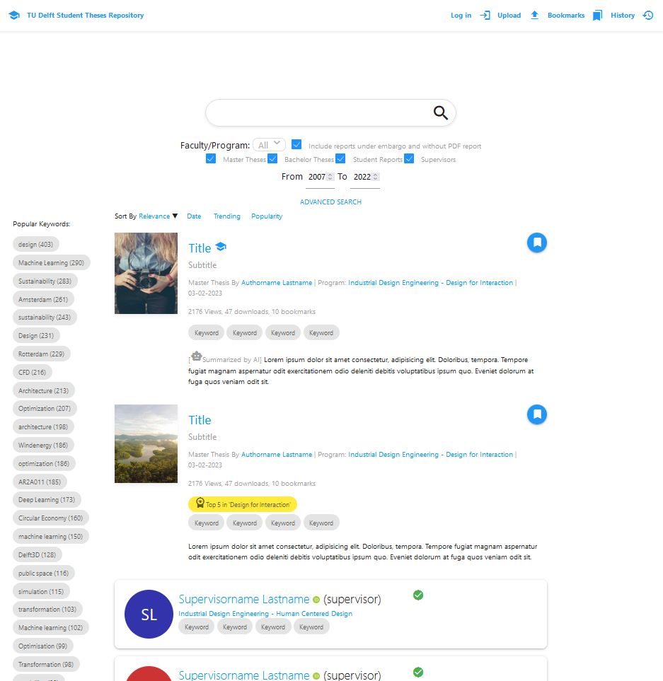
- ● 'Thumbnail' images, graphical abstracts, posters, embedded videos, and interactive embeds (such as 3D model viewers), which show what the thesis is about.
- ● One or two sentence 'pitches' under titles that allow users to quickly assess interest.
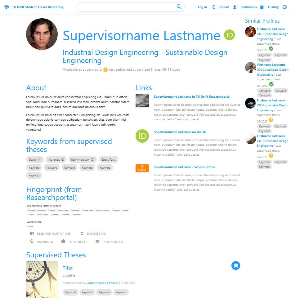
- ● Views, bookmark, and download metrics that show how popular a thesis is; Entry awards; featured theses; and supervisor highlights make it easier for users to find examples of good projects.
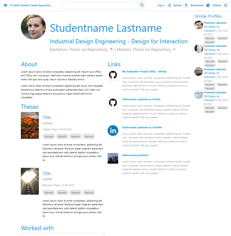
- ● Supervisor profiles that show all their supervised theses, some information on what they do, and if they might be available for supervising your project.
- ● Publishing theses will no longer be mandatory, so people who aren't proud of their mediocre thesis will show up less.
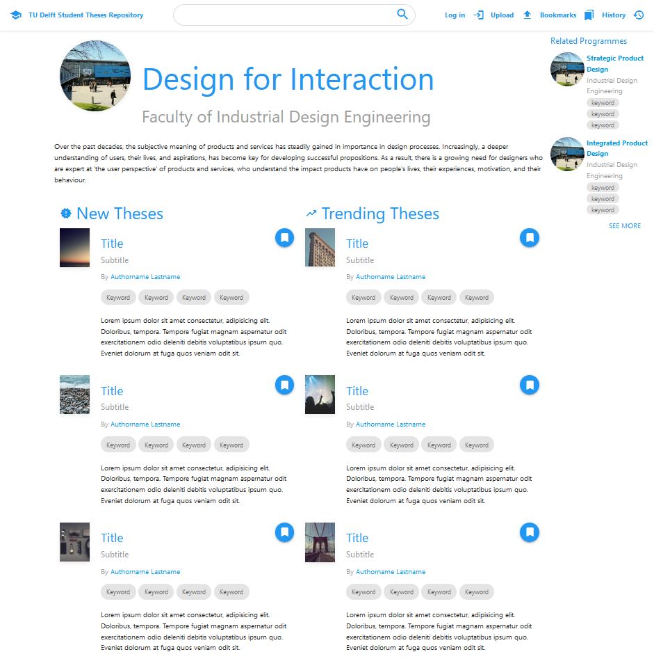
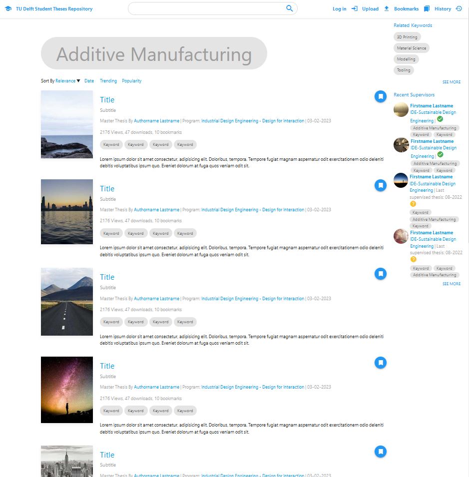
- ● Related theses/supervisors/keywords in a sidebar can help a user find more of what they're interested in.
Introduction
Why?
The TU Delft Library has been keeping copies of students' graduation theses for a very long time. They switched to using digital PDF file copies in 2007. For their archiving system, they currently use Islandora 7, which will no longer be supported in 2023, and will therefore no longer be getting any security updates going forward, leaving it vulnerable to hackers. The library therefore has been looking for a new storing system, that also meets the needs of the modern graduation students.
Students are enthusiastic about using multimedia and interactive elements in the reporting of their theses. Some even make their whole thesis in the form of a website. These report websites aren't currently able to be archived by the library. The library wants their new system to support all filetypes, and to store files of up to 1 gigabyte. The front-end of the current repository (the website that the user sees) only shows text metadata (like authors, supervisors, date, title, subtitle, abstract, etc.) on an entry. If someone uploads a video or image, the reader has to download it before it can be watched.
The library's goal is to create an inspirational learning environment, maximise TU research output visibility and impact, and to archive and make research available to all . Currently, the boring theses repository is not inspirational, it's impossible to archive interactive/multimedia reports, and the repository is not creating enough visibility for theses.
The biggest usergroup is students who want to see what a graduation project for their masters is like, or to get inspiration for how to make their report. But finding reports of only your masters, and finding the good ones, is nearly impossible. (see "interviews")
What?
It is therefore the perfect time for a new design of the repository's front-end. The new design must be able to support and display interactive, and multimedia elements, including full-website reports; the entries must be engaging for the users; the entries must be optimised for search engines (this is called S.E.O., or "search engine optimization"); and it needs to fit the needs of the users.
I've discovered that the people who use the repository the most are students who are orienting themselves, trying to find out what a graduation project in their masters might entail; students who are already busy with their graduation projects who are curious as to what a good graduation report for their masters looks like so they can get inspiration; Students who are about to upload their report. Researchers also sometimes cite master theses for their work , and headhunters who are looking for specialists fresh from the university also exist. Other important stakeholders are the data maintainers at the library, and the supervisors. (See "interviews", and "Do researchers cite master theses?")
How?
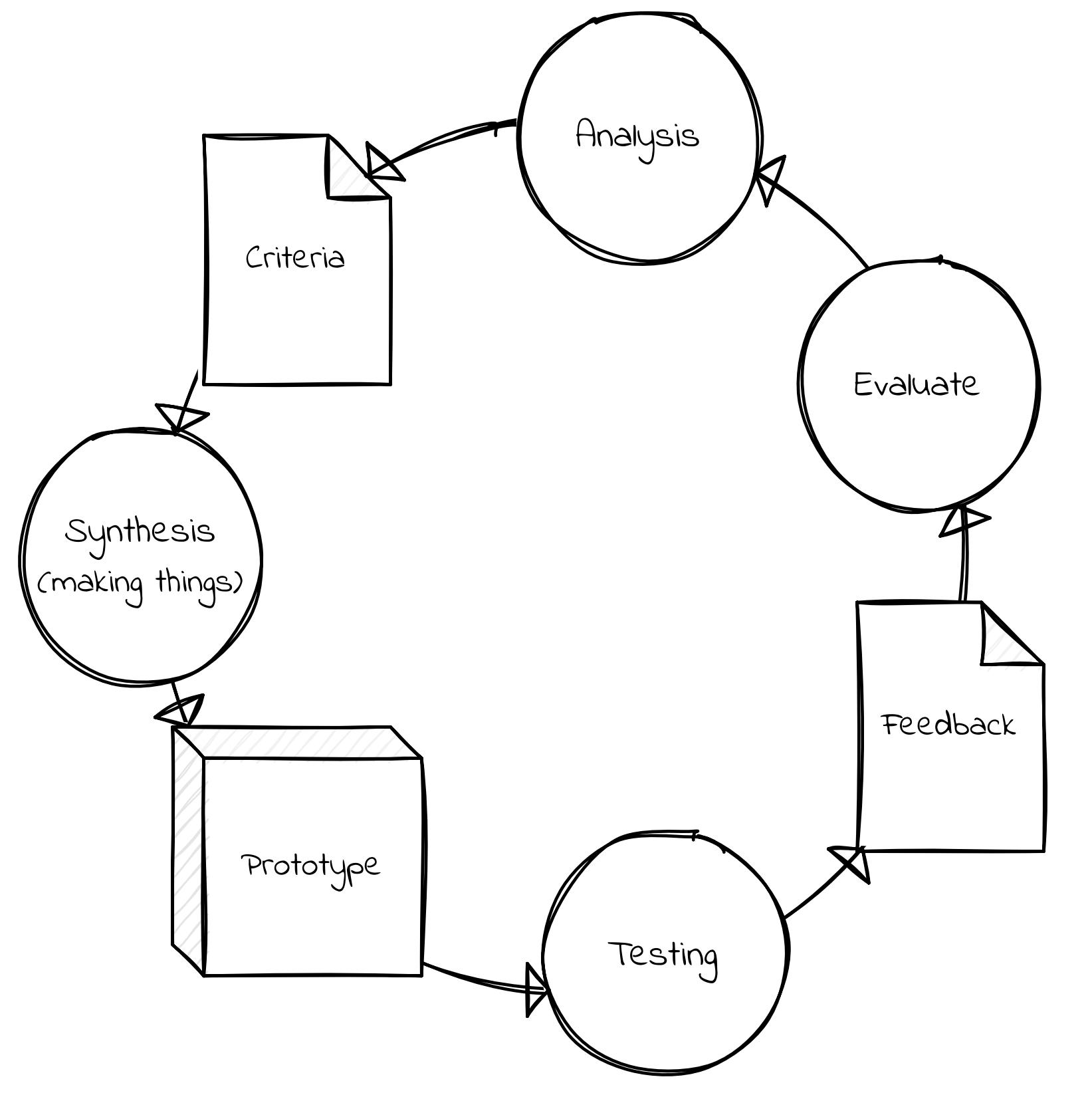
I used a version of the basic design cycle, that can be found in the Delft Design Guide on page 45. The Basic design cycle consists of doing research into what is necessary for the design to be good and creating criteria, which will help you 'synthesize' a good design. You then make a prototype for your design, and test with the users, using their feedback to analyze and reassess, creating a new design/prototype, and so on, until you are confident you have a great design. Usually, your prototypes increase in quality over the cycles.
I used quick hand-drawn paper prototypes, Figma mockups, and actual websites made in HTML with JavaScript and CSS that users can click through.
I worked on this project for 20 weeks, and made a design document that programmers in the library can use to build the new front-end when the new archiving system is implemented. My planning can be seen in this Gantt chart.
The research questions of my project are:
- ● What types of (interactive) media can be useful for reporting for the different majors?
- ● How do we encourage students and alumni to add (interactive) media to their reports / the repository?
- ● What do these new (interactive) multimedia reports look like?
- ● Is there a way to (programmatically) add multimedia elements to already published reports?
- ● How do different users use the repository? What are their wants and needs?
- ● How can the design of the repository and its search engine support those usecases?
- ● Does this new repository design fit the wants and needs of its stakeholders?
Who?
I'm a Design for Interaction student at the TU Delft. I've also done my bachelors in Industrial Design Engineering there. I've had some experience making videogames from high school, but when I started making an application for a complicated boardgame I love in my 3rd year of my bachelors, I fell in love with the field of UX design, and how quickly you can iterate and deploy solutions to people's problems.
I have become quite skilled in the field, and I'm looking forward to starting a career in UX Design, perhaps at an agency. I'm looking forward to showcasing my skills with this project, and learning even more about interface design along the way.
Erik is specialized in materials, manufacturing, and design. When one of his graduation students created a website-as-report, he got enthusiastic about improving the repository to support such innovations in reporting.
Jeff is an expert in data management and open science. He works at the future libraries lab where he investigates the ways people produce and interact with digitized cultural artifacts: 3D scans, maps and especially texts.
Armand knows all the inner workings of the library, and what the needs of the workers there entail.
Who uses the Repository? What do they need?
In order to make designs for the repository, I first needed to know who uses it, how, what problems they encounter, and what their needs are.
Interviews
I've interviewed multiple stakeholders and experts on the repository and multimedia. (see Delft Design Guide p.91 for more information the method)
'S' also tried to benchmark for graduation reports. They tried to see what other people that had the same mentor as them uploaded. Mentors sometimes have multiple entries for the same person, so this was a no-go. They tried to search by track, and by tags, but tags are case-sensitive, which diminishes their usefulness a lot.
S also uploaded their report during an incredibly stressful time due to a miscommunication. They are not good at writing, and they would have preferred to show their prototype on their entry page instead of their report.

Carolijn tried to see what an IDE-SPD graduation report looked like. She had trouble finding the repository due to its name. She didn't know if she should use the "Research repository", or "Education repository". Finding IDE or SPD projects was difficult, as the master track search is broken. Searching by subject is also not very useful, as there's no guidelines for students what to add there.
Uploading her thesis was very stressful, as she was still worrying about her presentation. Since she knew that her mentors wouldn't download her report from the repository, but from another email, she didn't put much time in her repository entry.
While she is not proud of her report, she is proud of her presentation and final concept. She would have preferred to have her poster or presentation highlighted on her entry page.
'L' doesn't have a graduation project yet, but he wanted to see what a DFI project graduation project looks like, what quality is expected, and what the students mentored by his favorite professors have produced.
Searching by keywords and track is again difficult. Searching by professor also proved difficult, as mentors often have multiple entries in the system, so it's difficult to find what they've produced.
'L' mentioned that the repository feels like a morgue more than a library. It's where reports are stored when everyone is done with them, it doesn't feel like a place of knowledge that encourages exploration. 'L' would like to see features that highlight the exciting parts of a graduation, such as renders or a prototype, as well as making it easier to share projects with others.
Chris is worried about the TU Delft focusing too much on producing academics, and too little on producing engineers. He would like to see graduation projects done in multidiscliplinary teams that produce feats of engineering, and he would like to see reports become more about the design decisions made while working on the project.
While he thinks that a live demonstration would be even more valuable for evaluating a student, embracing multimedia to capture the project would go a long way.
I interviewed Ruud Balkenende about the possibilities of multimedia reporting at the IDE faculty versus the current report styles, the importance of reporting in grading students, and the way educators use the repository. Ruud noted how the TU Delft's education quality gets audited by the government, and that is something to keep in mind.
Erik told me that supervisors have no interaction with the repository during the graduation process at all, except when something goes wrong.
He thinks it would be great if the student could work and edit on their repository entry throughout the project, and hit a button to have it approved by the chair (and when there might be confidentiality, also the company chair) for the final edit.
He often gets contacted by companies that inquire about possibly making their problems graduation projects. It would be great if the repository could already show related projects, and what kinds of facilities at the TU were used.
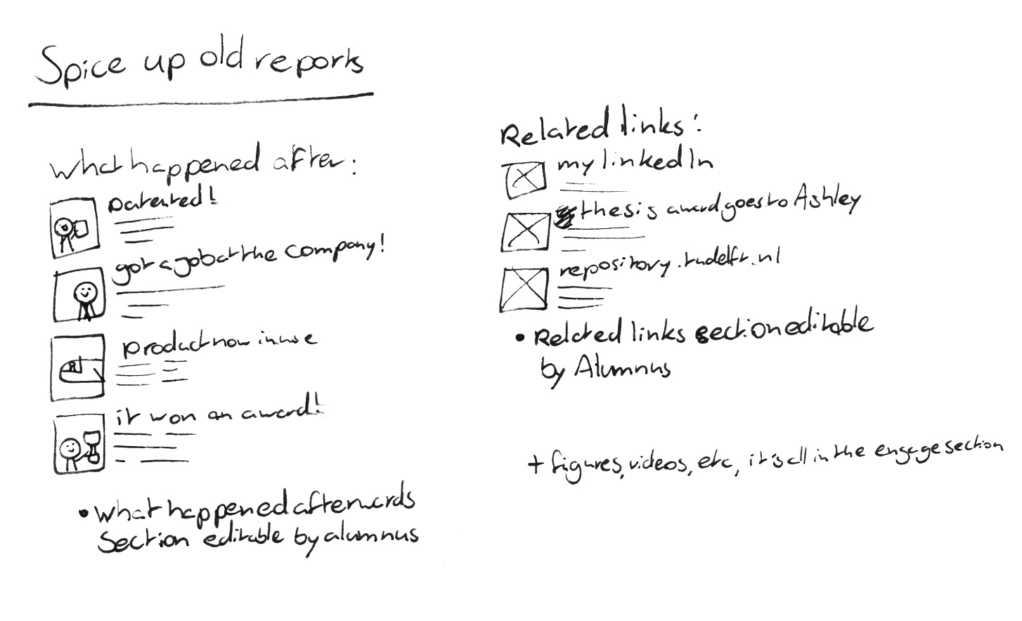
A great way to keep the entries more up-to-date, and invite interaction would be to have the alumni be able to edit a "What happened later" section, where they could talk about whether they've gotten any awards, jobs, patents, etc.. As well as buttons for sending (pre-made?) questions to supervisors.
-
note_altSee notesINTERVIEW ERIK TEMPELMAN ABOUT THE TEACHER'S WORKFLOW
leraren zien niets van de respository
geen enkele interactie in de workflow
alleen wanneer er een deadline is verstreken moet de mentor bellen
of uiteindenlijk toch vertrouwelijke informatie
teacher zou willen kijken of er al iets in dat onderwerp is gedaan
veel energie en tijd in bemiddelen tussen bedrijven en studneten
stopt een breifje in de afstudeerbank
het zou nice zijn als er te vinden is of er al een keer iets mee is gedaan
(waar kan ik een geluidstestkamer vinden etc.? zou in de repository misschien te vinden kunnen zijn
Heb je al een report? kijkt in de kast. moet de repository worden.
de student moet te horen krijgen "de repository is nu open, je kunt er aan werken, de deadline is hier", knopje met "notify committee/contributers"
project is vertrouwelijk verklaard "may contain sensitive information, approval by company mentor requirement"
notifications wanneer er former master students een update hebben gedaan.
het kernpunt: bal bij de chair ligt om het rapport te authoriseren,
goed als het makkelijk gedeeld kan worden.
mss een low res versie als je op download klikt, en de echte versie op de website
minder redundant backups daarvoor
relaxed voor de student om het te updaten.
soms worden chairs anders tijdens een project
de secretaressen hebben sleutels als backup, mss ook voor de chair approval.
mss praten met iemand voor de centrale studentenadministratie.
angeline westbroek alumnicontact met TU Delft!!! ex communicatiebeleid IO
- kan allemaal dingen bedenken
website als report moet niet verplicht worden.
boekjes moeten een optie blijven.
bijhouden hoe vaak de repository gebruikt word.
stats om te laten zien dat het goed word.
niet email, maar comment button/ contact form informeel
follow up vragen kanaliseren
voorgekouwde vragen / comments
Rein often goes to the repository to search for recently graduated IDE-SPD alumni to recruit for his company. He showed me how he searches the repository, and told me what kinds of problems he runs into, and what he'd like to see.
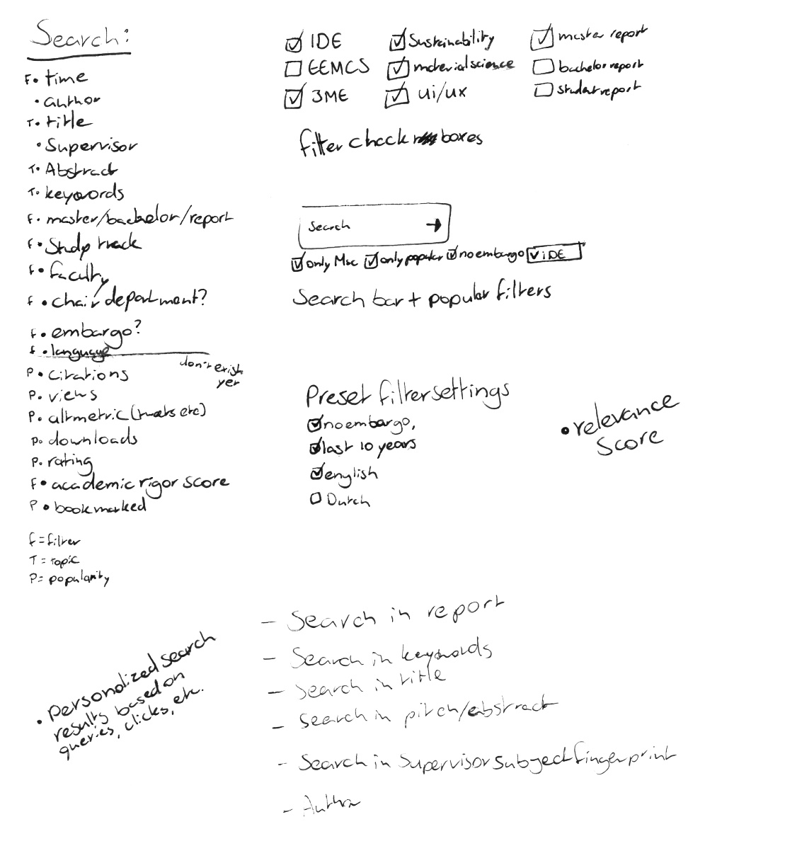
He often searches "Strategic Product Design", and filters out all the non-recent alumni. However, searching for "Strategic Product Design" does not provide as good results as a dedicated filter could. He also knows some of the names of certain teachers, for example, if he needs someone with skills in sustainability, he checks who recently graduated under Conny Bakker. He also often checks the theses of alumni he already knows, by typing in their name in the search bar.
Rein would like to see support for better filtering by master programme; a portfolio for supervisors, and what types of projects and students they helped graduate; LinkedIn links or profiles for the authors.
A User observation in the wild
Carolijn was working at her new job, and one of her co-workers told her to look at for his old graduation report in the repository so he could explain some things. I sat down with Carolijn while she did this, and made observations. (see Delft Design Guide p.89 for more information the method)
- ● 'Education repository' is a vague name. 'Research data' and 'Cultural heritage' are also not self explanatory.
- ● The author filter is useless.
- ● Searching for first and last name brings up the exact thesis you look for.
- ● The abstracts are very long.
- ● If a user is looking for the report, the rest of the page doesn't matter much.
- ● The search bar works quite well.
The Student's User Journey
To illustrate the different struggles that students have with the repository, the different ways they use it, and the emotions they go through throughout their graduation journey, I made the following journey map:
See it in full resolution here open_in_new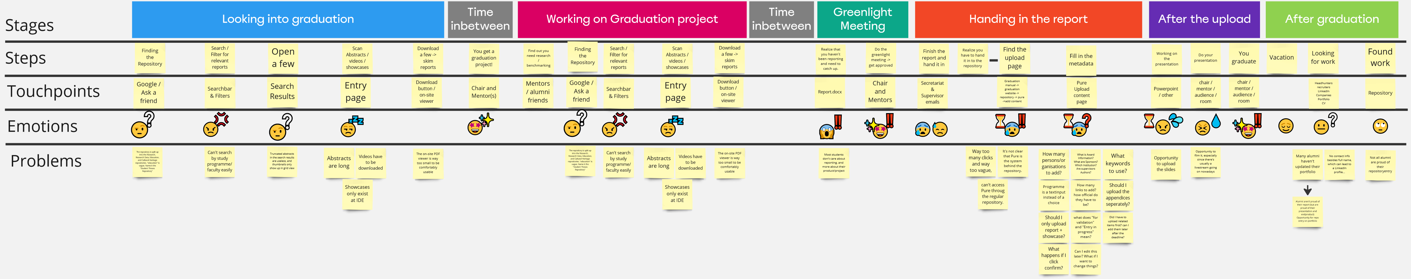
From this user journey it becomes clear that the information about graduation is not always in the most obvious places, which can be improved. If the repository website would feature more information that quickly shows what a thesis is about, and what masters programme it's from, a lot of frustration can be saved. The fact that the students need to upload their thesis to the repository before they're done with the presentation means that they're uploading their thesis in a very stressful time. If this was not the case, they could record and add their presentation to their entry, and take the time to add lots of other information to their entry, but now, it feel like a chore that students just want to quickly check off.
(see Delft Design Guide p.129 for more information the method)
Do researchers cite master theses?
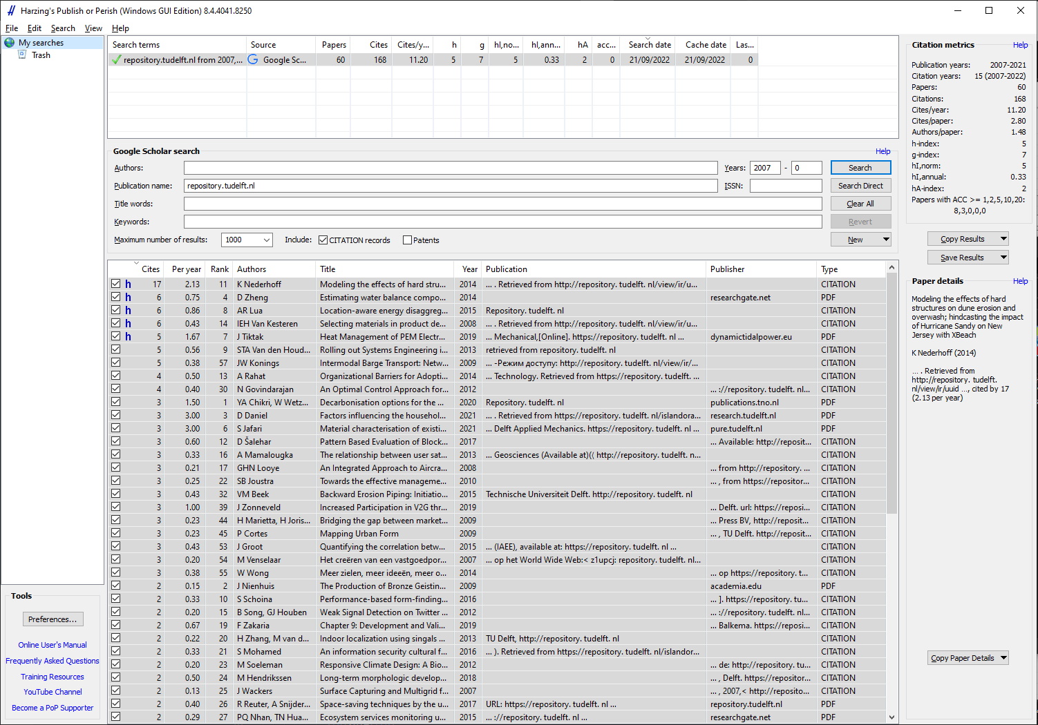
In order to find out if researchers use the student theses repository, we can check if they cite theses from it.
With Harzinger's 'publish or perish' application we can check data from Google Scholar (a scientific paper search engine) on how often theses from the repository get cited. The data shows that 60 master theses in total have been cited at all, for a total of 164 times.
A study has been done on bachelor theses that were cited from a different repository. In their paper "Who is Citing Undergraduate Theses in Institutional Digital Repositories? Implications for Scholarship and Information Literacy", Sean Stone and Sara Lowe found that the vast majority of undergraduate theses only get cited once, twice, or not at all. But when one gets cited, it is in someone else's thesis 33% of the time, and in a peer reviewed publication 24% of the time.
A look behind the scenes with an Editor
When a student uploads their thesis to the system, there is often a lot that is filled in wrong. Therefore, the library employs editors who check the upload submissions before they're shown on the repository. I learned that the things that often go wrong are:
- ● A lot of metadata is not filled in, or incorrect (things like awarding institution (which is always the TU), or coordinates).
- ● Email addresses and phone numbers are not allowed due to privacy laws, so they'll have to be removed from PDFs.
- ● Only images (.jpg/.png/.tiff), videos (.mp4), and PDFs are allowed currently, so other files need to be removed.
Conclusions: Stakeholders, Usecases, and Problems
This student hasn't started their graduation yet, but they would like to get inspired by the projects others in their master track have created. They might also want to see what supervisors often mentor projects on their favorite topic, or what kind of project their favorite professor often supervises. They could also look into what quality level is often expected from a graduation, and what a graduation report looks like.
Needs
This student has a project and supervisor team ready, but they haven't thought about reporting yet. They want to see what other students in their track, that did projects on the same topic, or worked under the same mentor made. They want to see quality reports, so they can copy the best practices from that report.
Needs
This student is making their master thesis report. They want to make their report engaging, and have plug and play support for these multimedia elements.
Needs
This student is about to upload their report to the repository, they are very stressed, as it's in the last weeks of their graduation, and they still need to make a presentation.
Needs
This person has graduated, their report is on the repository. They might want to share their page with friends or potential employers if they're proud of it, or they might want to hide or improve their page if they aren't.
Needs
This person knows exactly whose report they are going to download. They don't care about other people's report, they just want to go to the right entry and download the report. Most people who use the repository are targeted downloaders.
Needs
Keeping the repository up and providing access to thousands of papers for decades is no small task. The library staff wants theses to be findable, but they also have to worry about privacy, legal issues, and certain technologies, media, and dependencies becoming deprecated. Moreover, not all uploaders use the same practices when adding metadata to their entries, which can cause their system to become less useful.

Needs
Master theses are more cited than one might think. (Kushkowski et al., 2003) researchers and other students looking to cite master theses are redirected from Google Scholar to the TU Delft repository. They need to be able to see at a glance if the paper they are looking at will be citable.
Needs
Multiple interviewees have expressed interest in seeing what sort of great new research is on the repository, but with how boring it currently is and how cumbersome it is to download large reports and look through them, this usecase doesn't really exist yet.
Highlighting new theses of quality by track and topic, either through a homepage or mailing list, could inspire a lot of people.
Needs
* This stakeholder currently doesn't really exist yet, but I hope to make people generally interested in the research on the repository.
The headhunter wants to see who recently graduated in a certain field, and get in contact with them.

Needs
Currently, the supervisors have very little to do with the repository. But a new design could change that. Supervisors would love to show off their supervised projects.
Needs
List of Requirements
(see Delft Design Guide p.125 for more information the method)
- Must have
- ● Users must be able to easily find theses of quality
- ● Users must be able to easily find papers of their study programme
- ● Users must be able to easily find papers on certain topics
- ● Users must be able to browse papers in a way that lets them judge interest at a glance
- Should have
- ● Users must be able to easily find papers by a certain supervisor
- ● Users must be able to decide if they're interested in a thesis within 5 seconds
- ● UI must help to spark 'curiosity' in theses
- ● Users must not report feeling 'lost' (or similar emotion) when uploading
- ● User must feel like the UI relieves anxiety when uploading
- ● Users must be able to find the download button within 5 seconds of the page loading.
- Could have
- ● Researcher must be able to judge whether a theses might be useful for their work (to the extent one can when not reading the report) (moreso than just reading the abstract)
What can we do with Repositories and Media?
The benefits of media in reporting
The goal of a graduation project often includes teaching a student to conduct and report a piece of research on their own (de Kleijn et al., 2013). Reporting is a big part of the project, a survey of master thesis graders showed that communicative competence was rated "very important", and in the top 50% of aspects a report is graded on (Bourke & Holbrook,2011).
Teaching students how to report on their research has always been important, but over the years, universities have also started teaching how to communicate your research to non-scientists (O'Leary et al., 2015). Video is becoming an effective, and increasingly popular and recognized medium for formal (Kousha et al., 2012) and informal information spreading (O'Leary et al., 2015). A study showed that videos, as well as plain language summaries improve comprehension, perceived understanding, enjoyment, and the desire to learn more, in both scientifically educated, and non scientifically educated people (Bredbenner & Simon, 2019). Other forms of art has also become an increasingly prevalent way of research communication (Lesen et al., 2016) , and the TU Library has recently had a science-communication-through-art exhibit in the main hall (TU Delft, 2022).
The TU Delft Library wants to achieve an inspirational learning environment, more visibility for masters theses, and for students to be proud of what they publish (TU Delft, 2020). Students are also enthusiastic about a 'show don't tell' way of showing off their work; they also hope that this can help them find a job after their graduation (see interviews). The Library wants to achieve this with interactive media (TU Delft, 2020). While it is not proven that using media (specifically graphical abstracts) increase a work's visibility (Pferschy-Wenzig et al., 2016), it does provide all the other benefits mentioned above.
Benchmarking
I looked at other online repositories for inspiration and best practices.
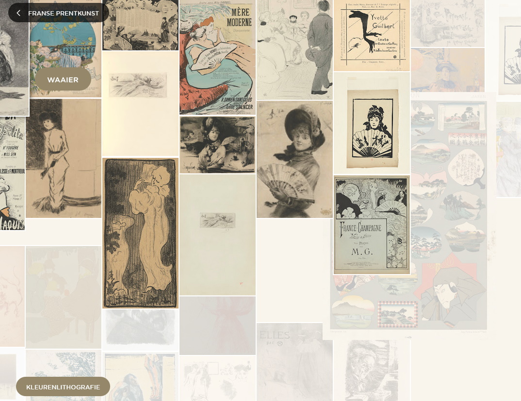 Discovery: Van Gogh Museum
Of primary interest here might be how things are clustered & displayed + selections for diving further into them.
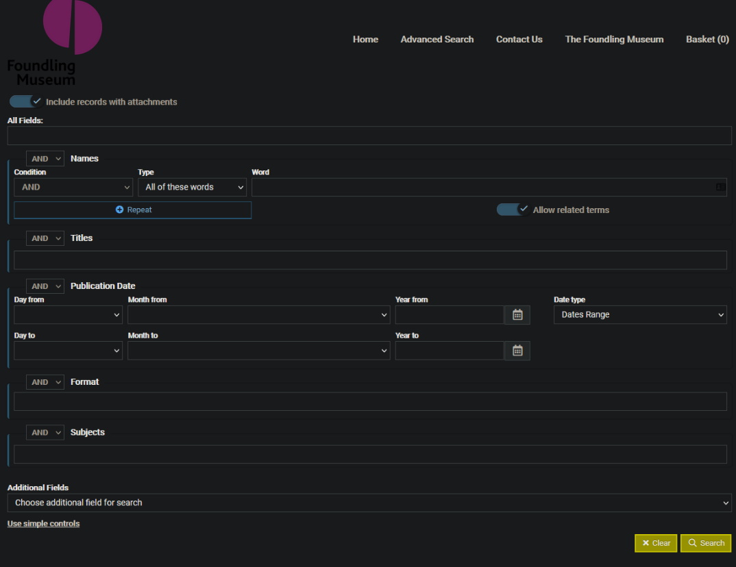 G.C.H. Collection: Advanced Search
The interesting element here is the bespoke advanced search they put together. The collection is multimedia, like our new repo might be, which presents quite a few challenges in search/filter/facets, but this one in particular has been cited as a good example for how this can be done well.
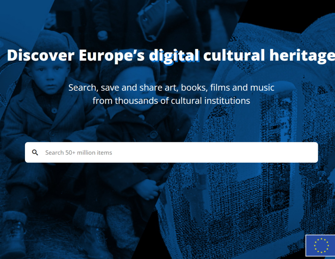 Europeana
Europeana collects cultural heritage (books/art/music) from multiple institutes. Its front page contains interesting ways to engage the viewer, such as highlighting topics, or featured articles.
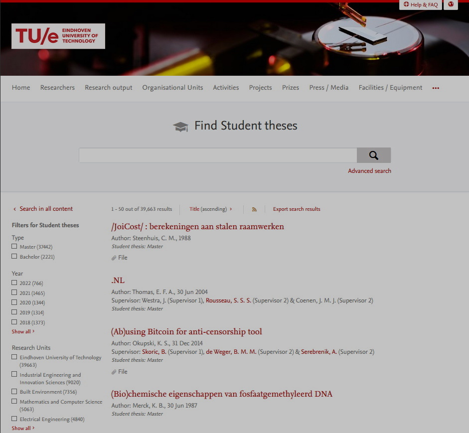 TU Eindhoven student theses repository
The TU/e repository has even less features than the TU Delft's repository, but the look and feel is definitely more modern. It has an advanced search menu and a good citation generator.
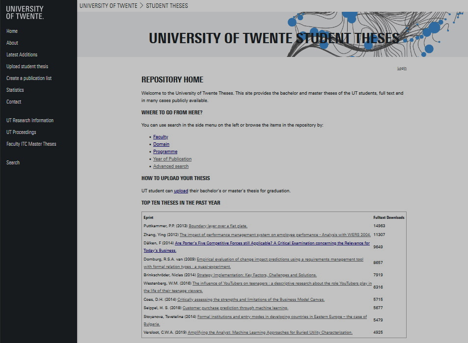 University of Twente student theses repository
The University of Twente's repository doesn't look fancy, but they have features like:
- ● Top theses on the homepage.
- ● Searching by faculty/domain/programme.
- ● A feature rich advance search function.
- ● Citation generator.
- ● Download, view, and reference statistics per paper.
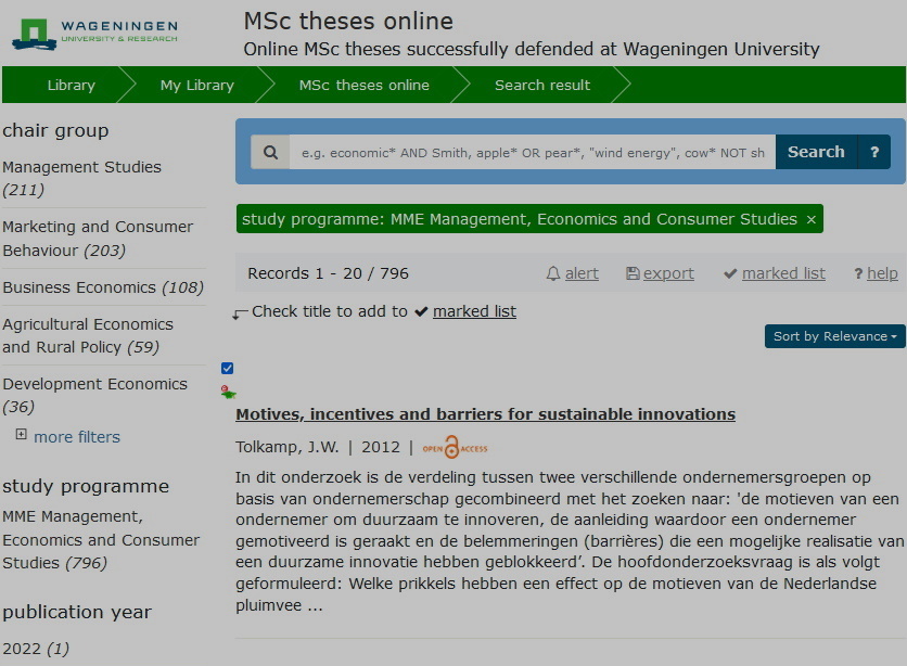 Wageningen University student theses repository
Wageningen's repository also doesn't look flashy, but they do have great features like:
- ● Bookmarking entries.
- ● Searching by chair group/study programme.
- ● Comments.
Previous work
Rethinking the student theses repository
In their September 2021 presentation, Connie Clare and Amineh Ghorbani, have noted that the poor findability; outdated presentation; and cumbersome upload process is a problem for master students.
They have multiple ideas for increasing findability and providing more features to the repository, such as:
- ● Linking to author and supervisor research overviews
- ● Metrics (downloads, views, citations, and altmetrics)
- ● Embedded report reader like issuu flipbooks
- ● A slideshow of the main figures
- ● Embedded media and simulations
- ● Graphical / media abstracts
- ● Word clouds
- ● Downloading in extra formats (html, epub, mobi)
- ● Citation grabber
- ● Bibliography maker
Their presentation slideshow:
Designing with existing metadata
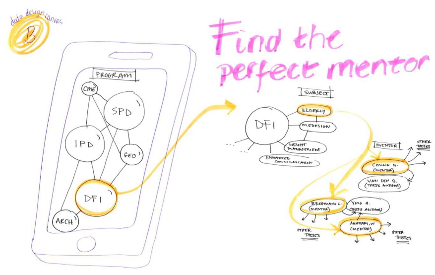
Péter Kun did a design experiment in his dissertation where he and participants, among other things, explored the possibility of the available metadata in the student theses repository for new uses. The result was a concept for an app that used supervisors, and the keywords of the projects they supervised, to help the user find the perfect mentor for their graduation project idea.
Embedded media and interactivity possibilities
Hyperlinking, tooltips, and citations (Kim, 2000)
I often have to explain that my graduation project is about:
"redesigning the student theses repository for embedded multimedia and modern usecases with a user-centered approach."
My mom doesn't know what most of these words mean. Engineering students often have to use a lot of jargon and buzzwords to get across what they mean in a concise manner. This makes reading their reports incredibly difficult for people not in their discipline. However, with hyperlinks, definitions can be given for them. Tooltips can do this even more quickly without taking the user off the page.
Hyperlinking can also be used for citing sources concisely without references to the bibliography sprinkled in throughout the report.
You can also use hyperlinks to refer to chapters in the report itself. Like this link that takes you back to the introduction. This is called "internal navigation."
Hyperlinking can also be used in PDFs, one thing to keep in ind then is that if someone prints the PDF, they no longer work, so separate references are still needed.
Another great way to use hyperlinks and tooltips is when talking about someone, and linking to them, or showing their credentials. For example, if I cited an interview
with
Ashley Hemerik
 Ashley Hemerik
Ashley Hemerik is an industrial design engineering student at the TU Delft
doing a masters in Design for Interaction with a specialized in UI/UX design.
She is mostly known for designing an encounter builder for Pathfinder 2e.
email | LinkedIn | H-index: 0
, I could credit her, and show her credentials and context without taking up
too much space or distracting from the report.
Linking to different articles on the same website also helps with search engine optimization.
Table of contents as a navigational menu
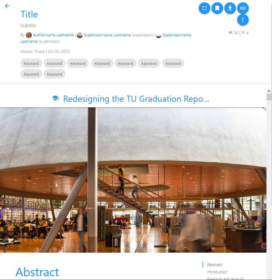
Graduation reports are long, and it can be easy to scroll past someone, or forget where you were when coming back to a report. A table of contents next to the report that can take you to certain chapters with the click of a button (like shown here on the right if you're not on mobile) can be incredibly useful, and can help the reader's experience immensely.
Audio, video, images, and animations
A picture speaks a thousand words. Almost every report made at the TU Delft contains images, these images could be used to make the abstract more understandable at a glance, and immediately show the product made during the project. At some faculties, users need to make a poster for their graduation, which shows the project at a glance. These incredibly useful images are currently locked behind a download button. Embedding images in the repository entry will make the entries much more valuable for many users.
Animated images could also do a lot to explain complex mechanics or processes in a quick manner, such as this animation of a certain type of piston engine
Vector images are also not a problem, and the commonly used SVG file format also supports animations, and is natively supported by HTML5.
A lot of users made videos to explain their project, or show their product tests. Some of these are already on the repository, but only as download links without a viewer. Students could show off their interviews, tests, animations, practices, etc.
Audio can be embedded and used to show interviews, podcasts, sounds certain machines make, soundscapes, and much more. You can already see in my report
Embedding from the TU dataset repository
The TU Delft dataset repository is sometimes used for student theses to provide open access to their research data. The dataset repository has an embedding functionality to view the files. This can be embedded to the repository entry.
Note: this widget doesn't work on every browser, firefox seems to have a problem with it.
3D Model Viewers
CAD Viewers
A lot of projects from the 3ME and IDE faculties involve CAD drawings. 3DContentCentral has an embeddable CAD model viewer that allows for things like wireframe viewing, and section views. Engineering students could explain their designs much better with this interactive tool, and readers can examine the author's works in a much more engaging way.
Bespoke embedded 3D applications
Three.js is a powerful framework for allowing interactive 3D scenes. Many people have made entire videogames with it. If a student wishes to create a bespoke interactive 3D application to explain their project.
The three.js website contains a lot of examples and links to in-browsers 3D applications.
Visit the Three.js Website for many examples open_in_new
Graduation report as a museum
If the student has a lot of 3d models or spaces to show, they could decide to make a virtual museum instead of a linear report. The shutdown gallery is a project that creates a virtual gallery the user's avatar can walk through and take in the artworks.
This could even be in virtual reality.
Another way to use the concept of a virtual museum is for allowing readers to walk through a museum of different TU Delft projects, they could walk through a gallery of 3D models, and stop by the ones that interest them.
Visit the Shutdown Gallery online open_in_newWeb XR (eXtended Reality, Virtual Reality, Augmented Reality, and Mixed Reality)
Virtual Reality, Augmented Reality, and Mixed Reality (together known as eXtended Reality, XR) are becoming more and more accessible and they are used more and more by engineers and scientists. Web XR makes XR now usable straight out of people's browsers, making XR experiences for explanations very possible.
XR could be used to view student made 3D models immersively. This could be especially useful for architecture students to show the buildings they've designed, or any student that designs a space.
Visit the Firefox Web XR demo open_in_newAdobe has experimented with viewing PDFs in virtual reality by somehow turning images into 360 degree panoramic images, and overlaying the relevant text onto them.
Embedding Python/Java/C/etc projects and compilers.
Almost all faculties use programming, and for many students their custom made program is a massive part of their graduation project. Python has become one of the most powerful and customizable tools for an engineer, with its ease of using libraries and its versatility making it the engineer's favorite advanced calculator. Java is used incredibly often by computer scientists and mathematicians. C is used a lot by electrical engineers programming embedded systems. The ability to embed a student's python scripts to their report, and have the reader try out their code, and play around with its parameters, will be incredibly valuable in explaining their projects.
JDoodle is a powerful online IDE and compiler that can run 79 of the most common programming languages, and it can be embedded into someone's online report or repository page.
Interviews
(see Delft Design Guide p.91 for more information the method)
Youth association 'de Koornbeurs' is a place where students with many different majors gather. To get an idea of what projects at different faculties look like, what digital tools they use, and what sort of media and interactive elements could improve their reports, I did a few rapid fire interviews with masters students there. Here are the conclusions:
- Mathematics uses Java, Geogebra, and LaTeX to write equations. It could be improved by adding the models in interactive elements so the reader can play with the parameters.
- Computer Science often uses Python, Java, or C. Projects often let the student frame the problem, design an app with certain features, build the solution, and run benchmark tests to see if it was successful. Reports can be improved if you could see the codebase, architecture, and if the solution could be embedded.
- Life Science and Technology almost never uploads to the repository for fear of plagiarism
- Physiscs projects often consist of doing/repeating experiments in real life. Their reports often don't stray far from the standard scientific paper format. It can be improved with embedded videos of the experiment, embedded python models, animated diagrams, and dynamic graphs. They often use Python, and up till a few years ago, Matlab.
- Biomedical Engineering projects often involve (re)designing medical appliances. They use Solidworks, Matlab, and specialized programs. Their reports could be enhanced with CAD models, embedded matlab models, animations, and videos of tests.
- Electrical Engineering projects are often about framing problems and creating an electrical circuit for it. They often use Matlab Simulink, pSpice, and Oscilloscopes. Having an embedded applet where a reader can play around with their electric circuits could greatly improve engagement with the report.
-
note_altSee interview notes
AN: The acoustics of the busy bar made audio recording not feasable.
WISKUNDE
Java
Eclipse
Overleaf latex
Geogebra
Lit reviews
Model van voorganger, haar code bekijken en verslag bekijken
Een model ia iets in java
Dat kan embedded
Met parameters spelen
De werkelijkheid namaken maar dan versimpeld
Maken van dienstregeling voor nsCOMPUTER SCIENCE
Thesis is a problem,create software to fix it, benchmark to show it's fixed
If you could feature the code in a way, if you could show system architecture,
Language doesn't matter
Java or python usually, or C
Big part is if you figure out what the problem is, what feature you choose, if it actually solves the problem, if the features make sense
Choosing the right problem and features.LIFE SCIENCE AND TECHNOLOGY
Moet intern blijven
Alles onderdeel van lopende research
Het word te snel gestolen.
Scripties zijn interne documentenNATUURKUNDE
professor geeft een onderwerp
Experimentjes waar het antwoord al van bekendis
Vooral programmeren in python
Data verzamelen met grafiekjes
Standaard paper
Fysieke opstellingen meetapparatuur, sensors
Python latex
Maple bij werktuigbouwkunde
Python en matlab word aangeleerd, matlab vroeger nu python
Dynamische grafieken moeten er in. Natuurkunde is heel erg papers schrijven
Als je met een website aankomt gaat niemand er iets mee doenBIOMEDICAL ENGINEERING
slecht zicht op wat een project is
Beeldvormingsalgoritmes
Apparaatjes herontwerpen
Mensonderzoek
Matlab
Solidworks
Krita of paint3d
Latex
Tussenstappen in ontwerp laten zien, misschien als slideshow
3d modellen
AnimatiesELECTROTECHNIEK
Bsc project is werken in tweetallen, onderdeel van een groter project
Droge schemas electrische circuits
Radio zender en ontvanger,
Zoek de requirements, ga ontwerpen, ga het bouwen
Circuit simuleren programma pSpice
Meten met oscilloscoop
Matlab voor plotjes uit data
matlab sIMULINK
Latex
Parameters mee spelen
Compiler, daar zou het interessant zijn als gebruikers een programmatje mogen typen en de stappen kunnen zien.
Michel, Roland, and Arno talked about the modern possibilities in embedded interactive multimedia, as well as graphical viewers of the macro level of the repository entry. From the futuristic, reports as VR museums, to the more recognizable like Mac's 'Coverflow' file previews.
We also talked about the importance of an interesting presentation when browsing information
I asked 'A' over text about the tools aerospace engineers used, and what a typical project looks like. 'A' has made multiple programmes for optimizing airplane components herself, some with graphical user interfaces, and some not.
She explained how aerospace engineers often string tools together, and how they create their own when designing airplanes. We discussed if these could be embedded into digital reports, and what their output would look like.
'A' thinks that tools for preliminary designs could be embedded, and would be interesting for readers to play around with, but when it comes to analysis and advanced designs, the programs get incredibly complex, and only the output will be interesting for the reader.
-
chatSee chat conversation
Klein vraagje, die simulator/calculator van hoe de vinnen in een jet engine moeten staan en hoe lang ze moeten zijn etc. Waarin heb je die gemaakt, en zou het mogelijk zijn om die ineen website te embedden? En zo nee, zou het makkelijk zijn om het zo te maken dat het wel te embedden is?
(Niet dat ik wil dat je het doet, ik ben gewoon benieuwd of het mogelijk is)
Mijn afstudeerproject gaat overinteractive embedded multimedia in afstudeerverslagen
Bedoel je als in staartvleugels?
Ik denk het wel :)
Of bedoel je daadwerkelijk in een turbine/compressor?
Ik denk die
Dit is vrij eenvoudig
Je had er een programma voor geschreven
Dit is absoluut hel
Wel... Like 10 programma's wearing a trenchcoat pretending to be one
En dat was niet echt pretty want het is echt super super ingewikkeld
Haha alright
[Het turbine optimalisatie programma] Voor deze - het kan maar het is het echt niet waard
[Het staartvleugel optimalisatie programma] Voor deze: dat is prima te doen, en ik zou zelfs zeggen leuk te visualiseren :)
Okay, nice :)
Goed om te weten. Thanks :)
Stel, je kon verslagen maken als een website, had je het dan een webapp gemaakt? Of moet de backend gekke programmeertalen hebben waardoor je denkt "ze downloaden het maar"?
Ik heb geen idee hoe lastig dit soort shit is en wat voor talen er allemaal gebruikt worden in engineering
Helaas het laatste.
Wil je specifics?
Misschien? Is er een tool/taal/programma die vaak gebruikt word in aerospace?
Bij engineering hangt het dus echt af van de scope van het type project.
Eigenlijk kan het op één van de twee dingen neerkomen: een 'preliminary design', waar je eigenlijk alles zo goed als van scratch maakt (exclusief libraries enzo die je gebruikt). Vaak zijn dit soort projecten wat kleiner in schaal, wat minder precies en meer om een algemeen idee te krijgen.
Dit soort dingen worden vaak gemaakt als excel sheet (liever niet) of in iets als python, matlab of soms java(script). Deze programma's zijn vaak eenvoudige command-line programmas die input en output regelen als een csv/text bestand, of het meteen in de terminal schrijven. De daadwerkelijke analyse die je uit dit soort programma's haalt is vaak vrij eenvoudig, met weinig daadwerkelijke outputs. De iteratietijd en development tijd is dan ook vaak veel belangrijker dan dat het heel makkelijk te gebruiken is; het is gemaakt voor één specifiek doel, en wordt dan vaak ook niet verder gebruikt.
de tweede soort engineering project qua software is een daadwerkelijke analyse: Denk hierbij aan windtunnelsoftware, multi-dimensionale optimalisatie, finite-element stress modeling voor bijvoorbeeld load-dragende onderdelen.
Voordat je echt een ding goed wil analyseren heb je vaak al een preliminary design gedaan met zo'n simpelere tool als eerder beschreven, want de daadwerkelijke degrees of freedom zijn anders echt te groot. Je begint niet gelijk in een CAD software als je een vliegtuig wil ontwerpen, je berekent eerst ongeveer hoe groot de vleugeloppervlak enzo moeten zijn externally.
Zo'n analytisch ontwerp is vaak meer de details: dit zijn dingen die makkelijker te 'standardiseren' zijn, dingen die vaak worden gedaan. Daar bestaat dus vaak ook wel standaard software voor. Het is vaak dan ook minder programmeren, en meer gewoon simulaties runnen en simuleren.
Dit soort tools hebben vaak hun eigen manier van export; in engineering is het vaak helaas parseable text bestanden, maar soms heb je json of xml achtige dingen, of soms zelf daadwerkelijik beeld.
Bij grotere projecten wordt het alleen pas echt fucky, waar je dus een rare interchange krijgt van verschillende bestaande grote tools die eigenlijk als een soort human centipede aan elkaar gebeund zijn. Zo dus dat turbomachinery ontwerp ding. We hadden een stuk FORTRAN code die een simpele configuratie bedacht aan de hand van wat parameters, een cad parser die dat omzette in een geomery code, een CFD die dat dan simuleerde- overkoepeld door een optimalisatiealgoritme dat de parameters en de resultaten gebruikte om een optimum te vinden.
Hoe communiceren deze dingen? HEEL SOMS is er daadwerkelijk een API. Meestal is het helaas een bash/python programma die de output bestanden van het ene programma interpreteert en omzet naar input bestanden voor de volgende en het programma runt.
het is echt NIET sexy
dus voor dat soort dingen is het het vaak ABSOLUUT niet waard om een gui te maken
tenzij je deze dingen echt vaak herhaald.
*herhaalt.
En dan specifiek handmatig herhaalt. Want meestal zijn dit soort dingen grotendeels geautomatiseerd.
Als ik zelf wat algoritmes schrijf die ik graag wil hergebruiken, maak ik liever iets met daadwerkelijk een goeie API zodat ik het makkelijker kan integreren in een toekomstig project zonder dat het allemaal bestanden hoeft te schrijven die een ander ding weer moet interpreteren. Het is vaak veel belangrijker om een programma modulair te kunnen gebruiken dan het makkelijk als mens te kunenn gebruiken.
geeft dat wat licht?
sorry voor de wall of text
het is niet een leuk io antwoord, maar helaas wel vaak wat de praktijk is :(
ik wil graag ook nice gui tools
Haha nee dit is echt super handig, grote blij
Super bedankt
maar in kort: vaak is de analyse zelf vrij eenvoudig, dus de output/input door een gui maakt wat minder uit omdat je het toch in een excel sheet gooit en dan wat plotjes genereerd.
Wat veel belangrijker is, is dat je het kan integreren in een grotere pipeline.
Alright, goed om te weten
Dus de output is vaak: "dit is het beste ontwerp en het genereerd wel 7 aerospaces!"?
Of like, 2 newton weerstand, of zoiets? (Ik heb nog nooit een aerospace verslag gezien 😅)
Goeie voorbeelden voor preliminary designs
Voor uiteindelijke designs is het vaak juist het omgekeerde; GIGANTISCHE arrays aan herhaalde data
'schroef 1 moet 2.22mm dik zijn. Schroef 2 moet [...]. Schroef 344843 moet...'
Oh help
Okay, dat is goed om te weten!
Super bedankt!
Maar zelden, zelden iets ertussen
Yusss
Maar yeah- voor tools die je vaak op een specifieke manier (her)gebruikt is het logisch om een goeie Gui te hebben. Als je een duidelijke input, en een duidelijke (vaste) uitput hebt, en je vaak handmatig een input moet geven.
Echter, wat je vaak ook hebt is dat de input die je hebt nèt anders is. Zeg dat je programma graag massa als input wil. Echter, je hebt nu een ander programma dat je dichtheid geeft, en je kiest een volume.
Dan is het veel makkelijker om even snel een bruggetje te beunen dan om je UI een stuk ingewikkelder te maken om die flexibiliteit te hebben
En dan eindig je vaak met een klein python programma dat het ene programma runt, de output omzet naar massa, als input geeft voor de volgende, en weer doorgaat
De daadwerkelijke degrees of freedom zijn ZO GROOT dat je praktische niet voor elke mogelijkheid een Gui kan maken
Je kan voor één specifiek ding een grafisch element toevoegen.. maar als je vraag nu net iets verandert moet je echt veeeeeeel aanpassen
Dit is natuurlijk een triviaal voorbeeld. Sterker nog, als je zon duidelijk gedefinieerde input-outout hebt, kan het je vaak juist tegenwerken. Zeg dat ik nu bijvoorbeeld een can de outputs weet, maar een input niet. Als ik het programma niet aan kan passen moet ik iteratief te werk; ik gok een waarde van de massa, kijk wat voor output eruit komt. En dat blijf je herhalen tot je de waarde van de massa hebt gevonden waar je output uit komt. Dat heet in de engineering volksmond 'iteraten'.
Dit moet je niet handmatig willen doen. Daar zijn algoritmes voor
Maar dan moet je wel een programma in-out hebben
Waar zon iteratie-algoritme mee kan communiceren
Om deze reden wordt vaak de distinction gemaakt tussen verschillende soorten variabelen: Je hebt je 'Unknowns': Dingen die je niet weet, maar wilt berekenen/nodig hebt om andere waardes te berekenen
je hebt je 'Knowns': Waardes die je weet omdat ze de solution van een andere som zijn.
je hebt uitendelijk je 'parameters': Dit zijn dingen die je kiest, waaruit de andere dingen uiteindelijk volgen
Belangrijke distinction tussen parameters en knowns is dus dat je je parameters kiest; zeg 'ik wil een vliegtuig dat 200 mensen kan dragen, en het moet 4000 km kunnen vliegen'
Deze data kan er dan toe leiden dat je bijvoorbeeld 'minimaal 20 meter breden vleugels nodig hebt'
In deze context leiden je parameters direct naar je unknown
maar! Als je bijvoorbeeld nu de vleugelbreedte nodig hebt om de massa van het vliegtuig te berekenen dan wordt de vleugelspan je 'known', en gebruik je die om de massa te bepalen
Alles is dus SUPER gekoppeld
het aantal parameters is vaak VEEL kleiner dan het aantal knowns in the grand scheme of things.
heel veel dingen bepaal je dus impliciet, en niet expliciet
en nu om het nog fuckier te maken; in dit voorbeel leiden je parameters dus netjes direct to een output
maar stel je voor dat ik nu dezelfde tools heb, maar ik weet alleen dat 'mijn vliegtuig moet 200 mensen kunnen dragen en maximaal 40 000 kg wegen'
je hebt nu niet de input van de vliegafstand. Je moet dus nu het HELE ding omdraaien en iteratief bepalen
En dit soort dingen gebeuren VAAK in aerospace
weet niet hoe vaak dit soort dingen in io of andere engineering vlakken gebeuren, maar je eisen veranderen hier voortdurend. alles moet hyperflexibel zijn, en snel te itereren zijn.
Dus dan alweer, de focus meer op flexibiliteit en pipeline dan op stroomlijn.
Ik denk dat dat de belangrijkste punten zijn die ik kan maken ^-
hopelijk geeft dat een beetje ene idee!
What can we do with existing reports?
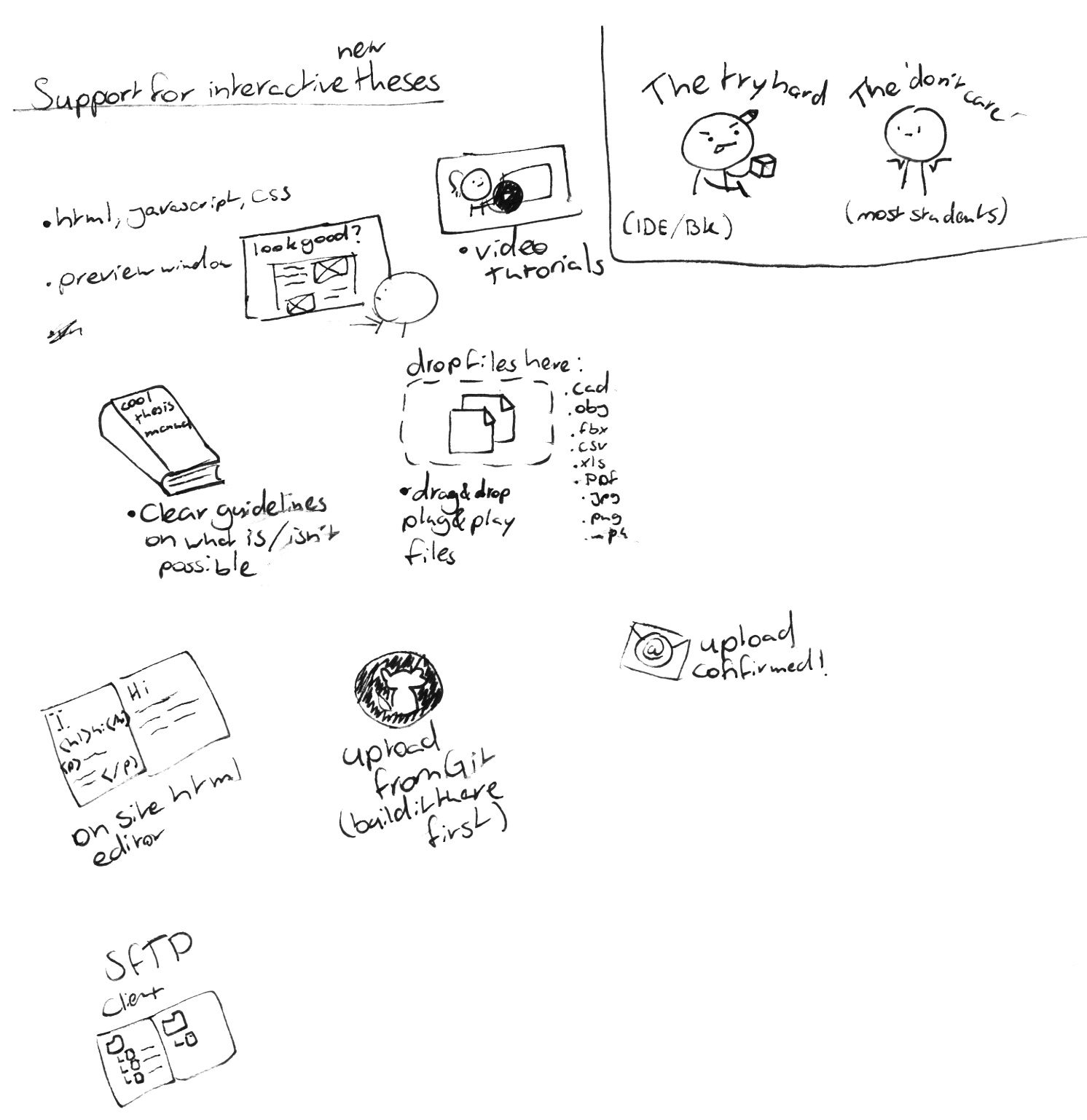
Providing support for students to add multimedia elements is important, but just as important is trying to add multimedia elements retroactively to the vast amount of already existing reports.
Extracting Images
Almost all reports have figures. Extracting Images from a PDF is quite easy. By showing the images in the PDF, either on a slideshow, or in an overview, a reader can quickly glance if the thesis will be interesting, or contain what they're looking for.
Wordclouds
You can make wordclouds from PDFs without too much trouble. A wordcloud is an image with a the most often used words from the report scattered throughout, with the most frequent words being larger. This can illustrate to a reader at a glance what might be in the text of the report.
Displaying and Extracting Links
You can extract links from PDFs. This can be used to embed linked media, such as showing a video when a student might have a youtube link in their report; or to create a bibliography of the used sources.
A bibliography could be made more interesting by showing how often the sources have been cited, if they're academic works or not, and showing link previews, like those that can often be seen in chat applications, as shown here.
Links can already be added in the current PURE system. These links, along with extracted ones could be displayed with the title, description, and image from the meta tags from that link, (see the image for an example).
Viewers for existing files
You can already open an on-site PDF reader, but it's hidden, small, and not many people know about it. Making it larger and opened by default will make the entry feel a lot more interactive.
Some faculties demand that a student also uploads a 'showcase' of their graduation project to the repository. These can be incredibly valuable, as they're essentially already media abstracts. They are often videos, or posters. These should be displayed right next to the abstract, or even before it.
Related articles/profiles/items
You can use the existing repository items to our advantage. With keywords, words in the title and abstract, and other works by contributors, you can create a list of related articles, related supervisors, etc.
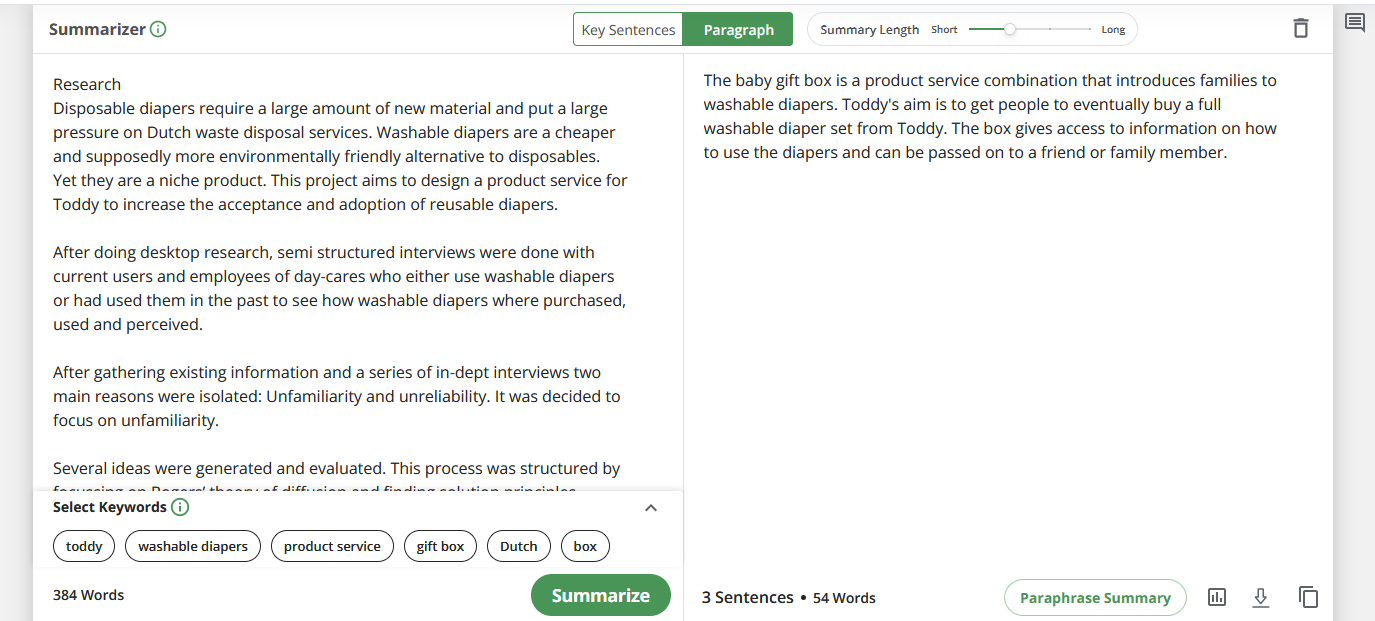
Summarize abstracts into 'pitches'
Search results currently show the abstract as a description, because of how long these are, they get truncated, and become useless. AI technology can summarize these long abstracts into shorter versions that will miss some information, but will give the user scrolling through the search results a much better idea of what is in the report. The results look very promising.
Coordinates into google maps embeds
The Current Pure system already allows for adding coordinates to your entry. We can use that to show a little widget from google maps that shows the location, such as this one.
Ideation
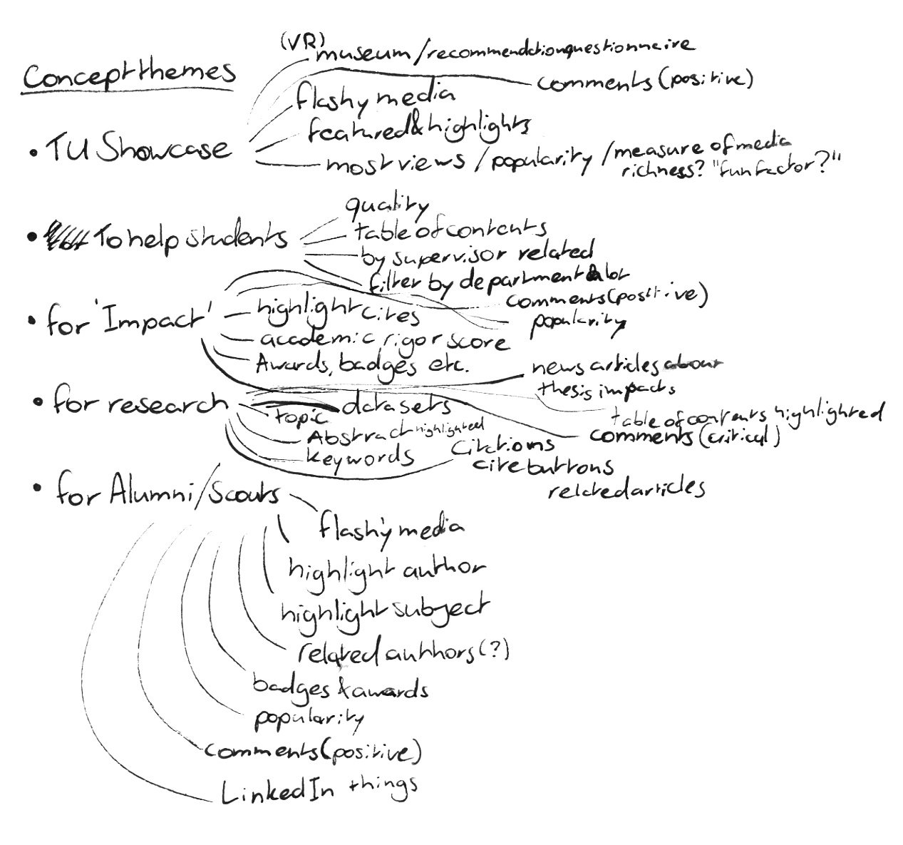
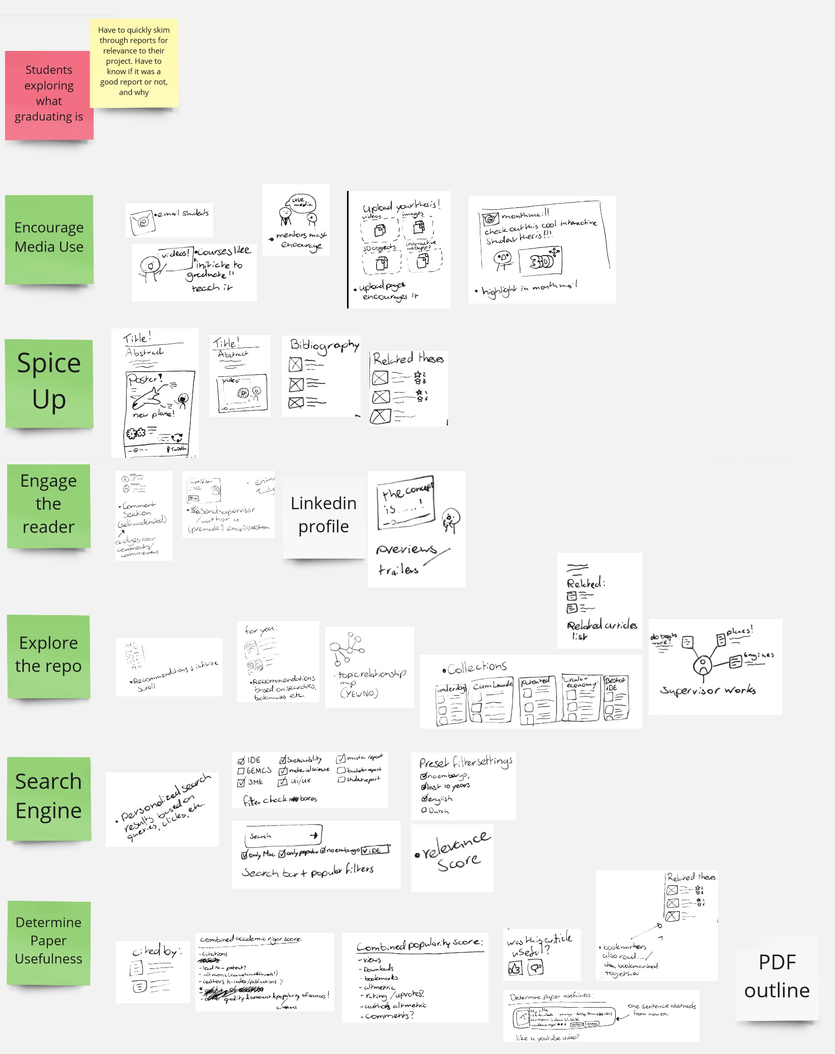
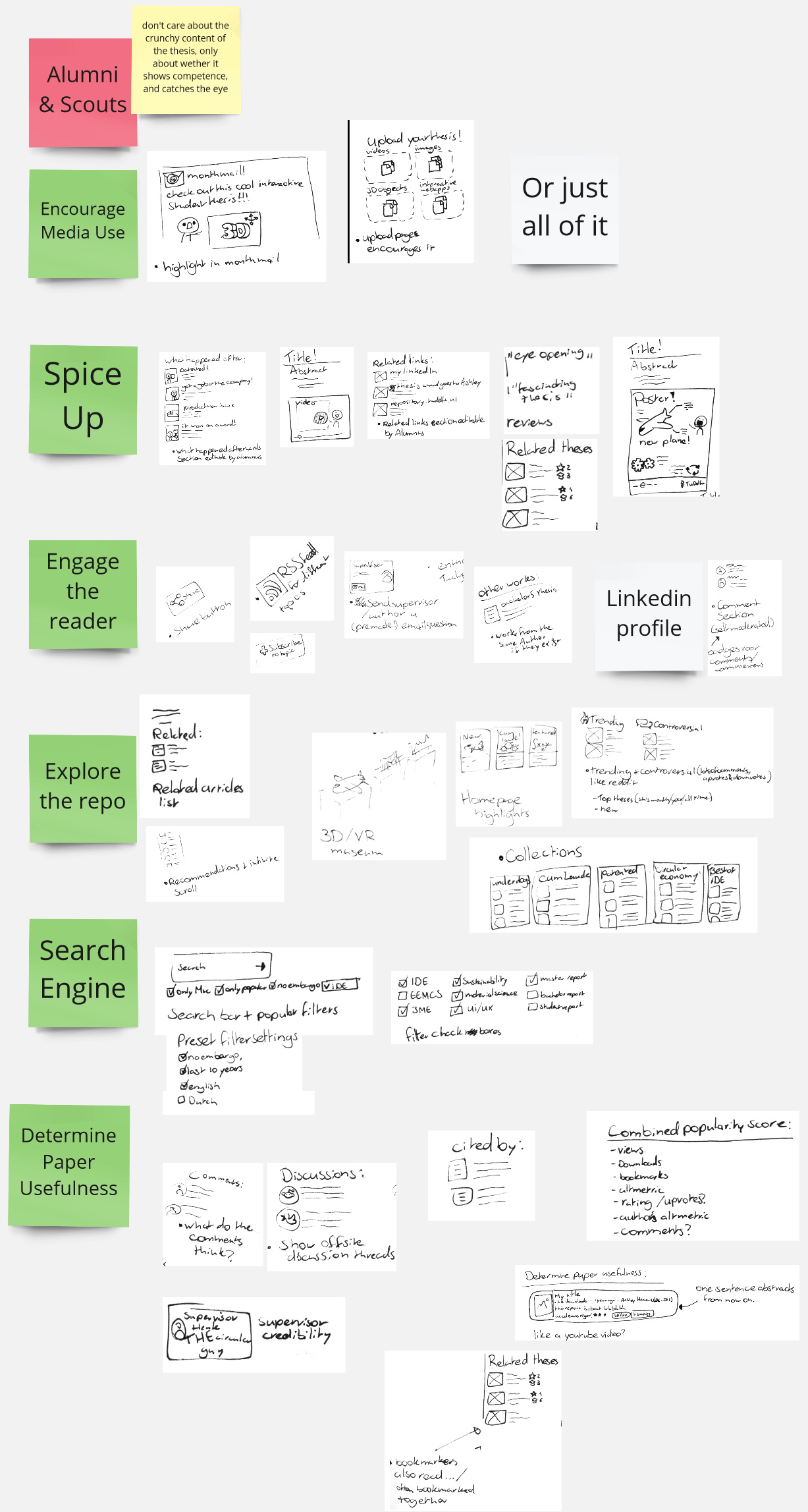
Now it's time to come up with ideas. During the research phase I already came up with a lot of ideas. I decided to write them all down, gaining inspiration while doing so (braindrawing); sit down with some students from a different faculty to get them to quickly write some ideas (how-to sessions)
Braindrawing
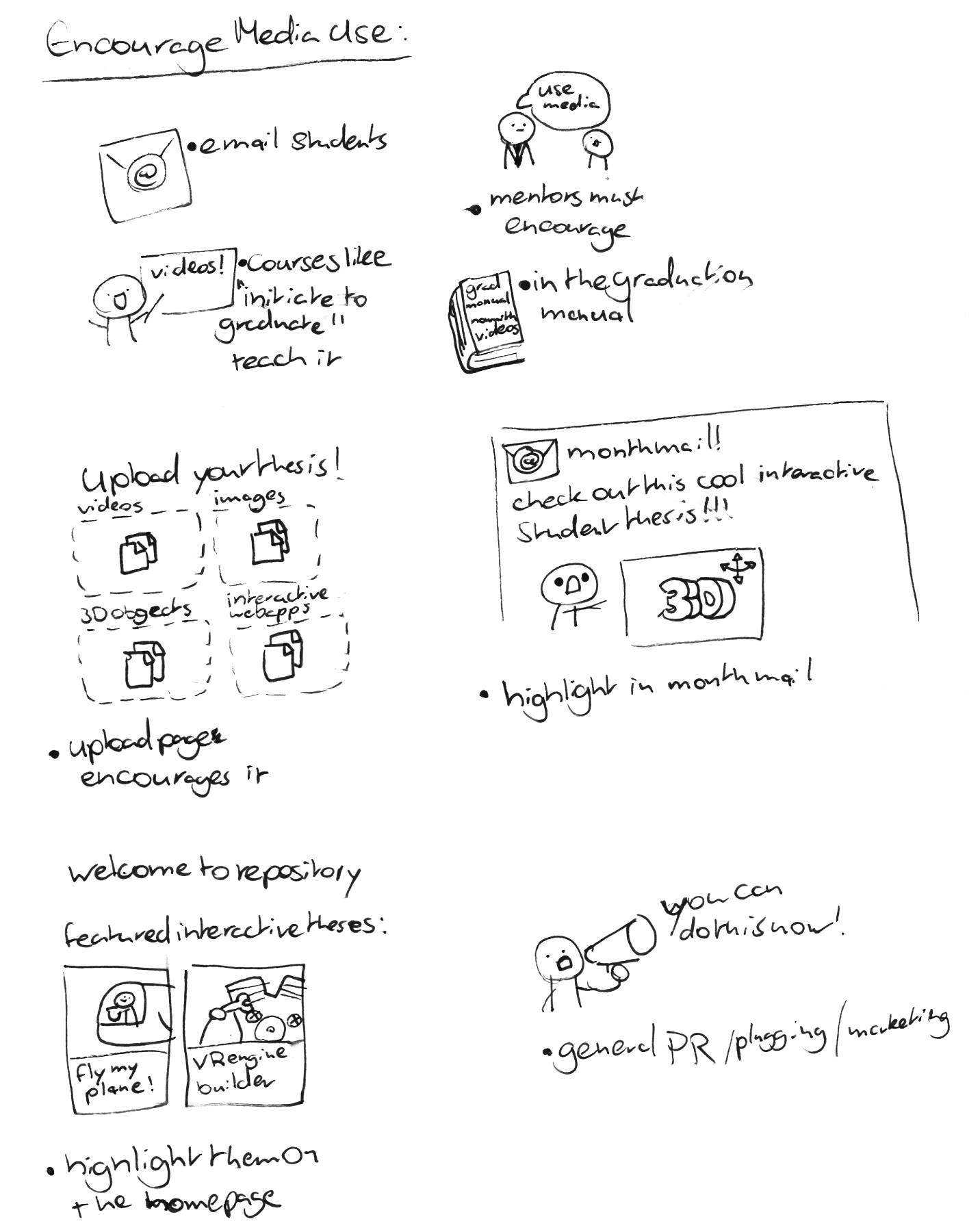
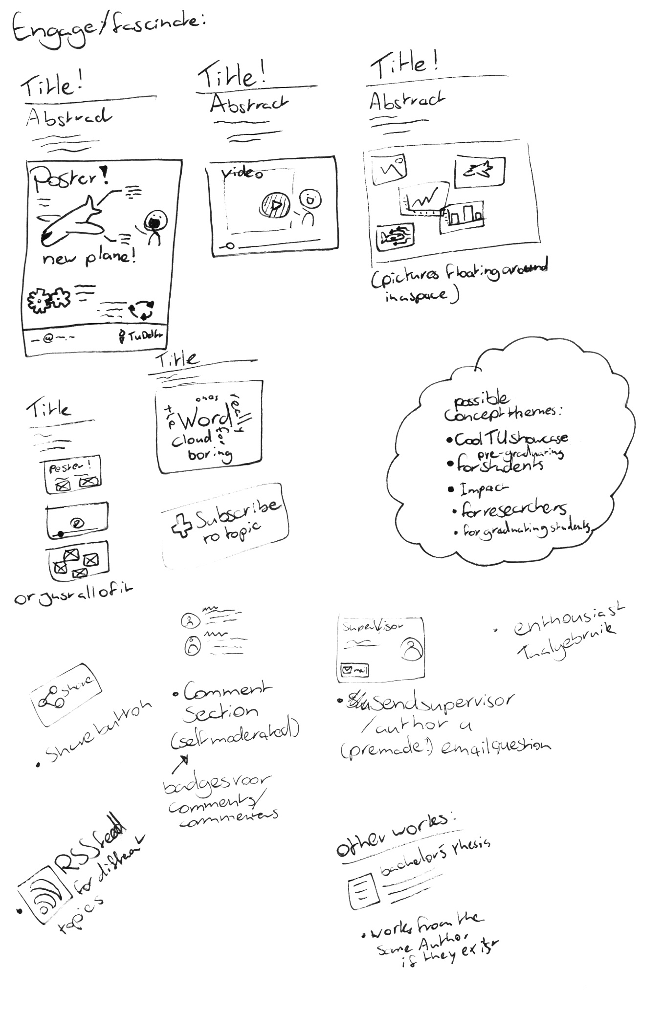
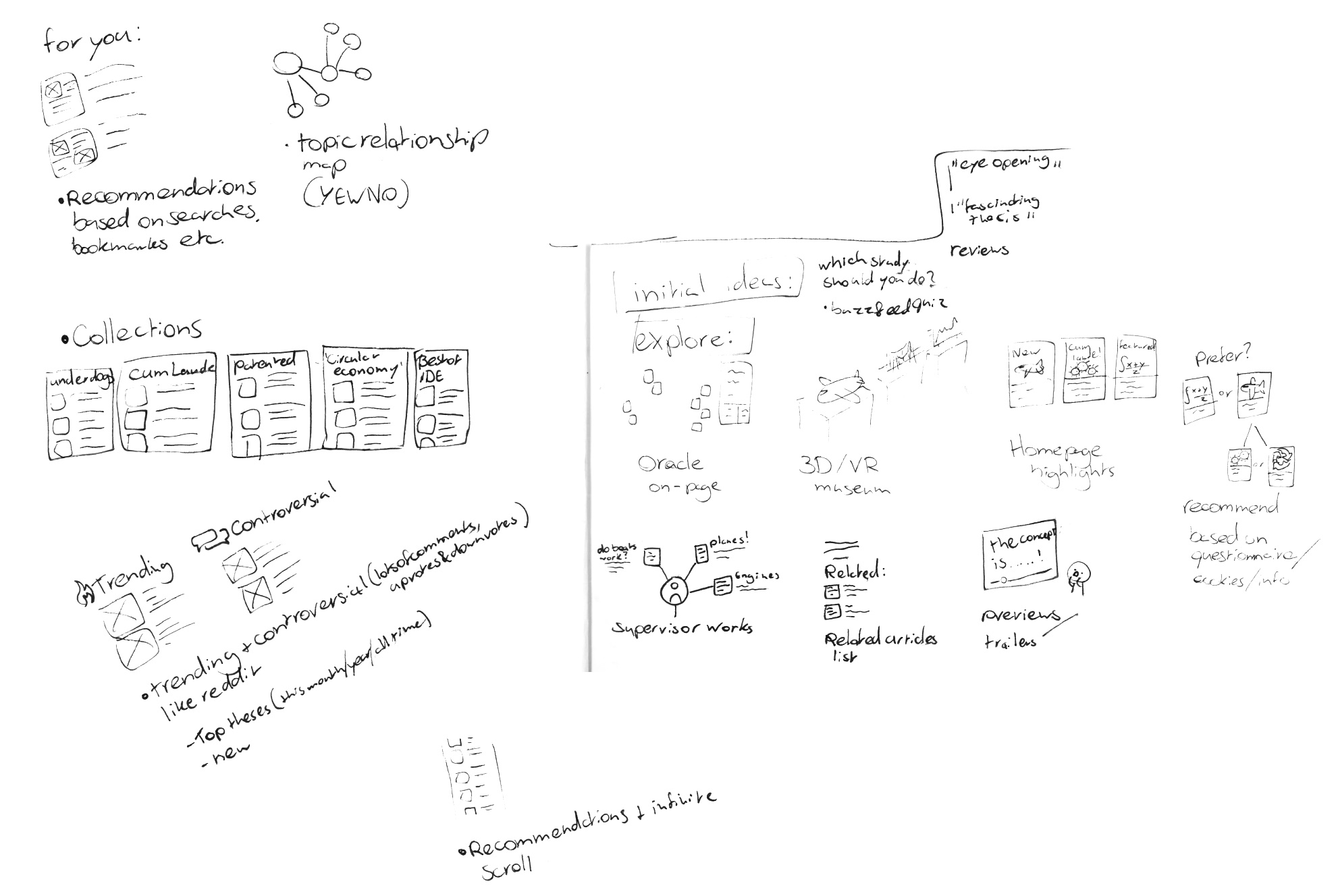
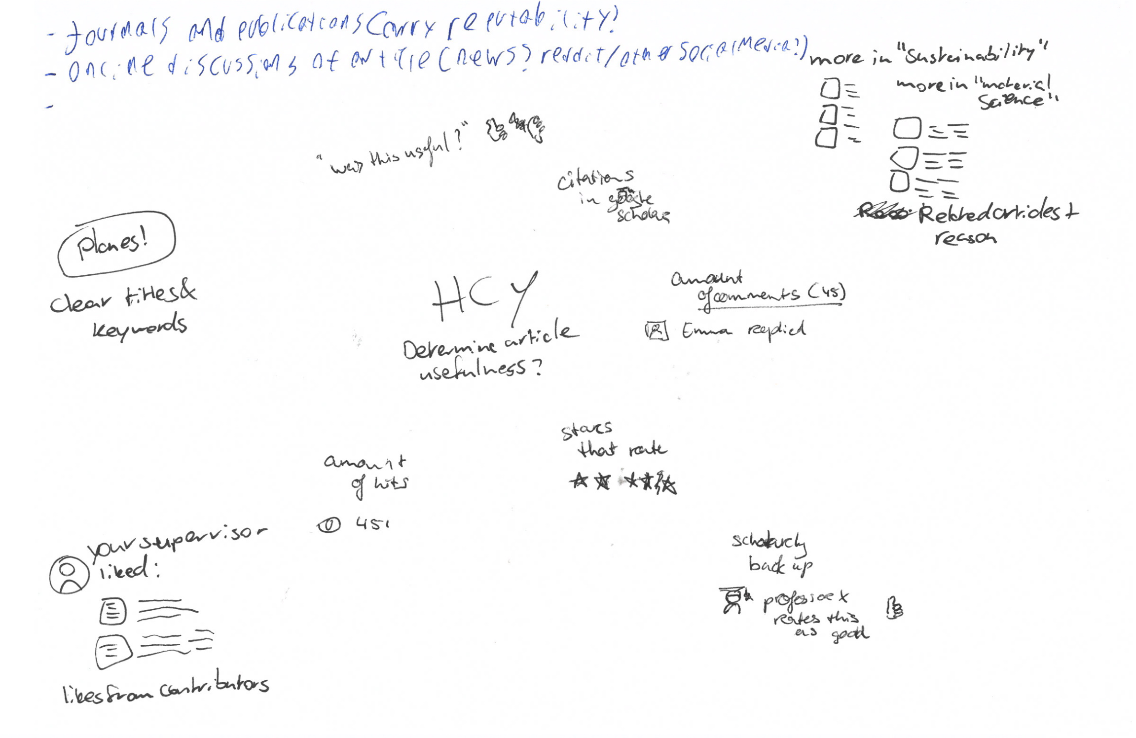
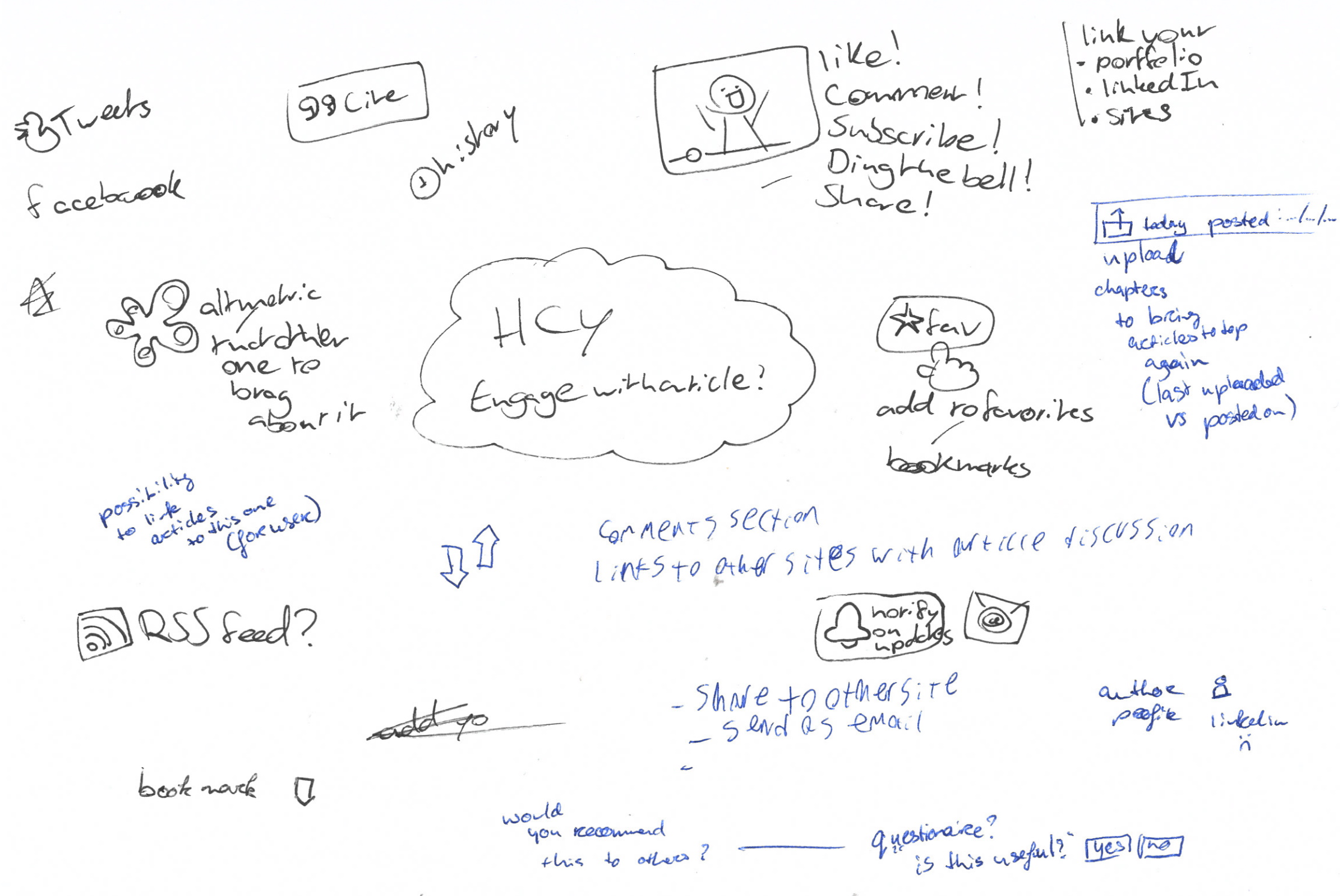
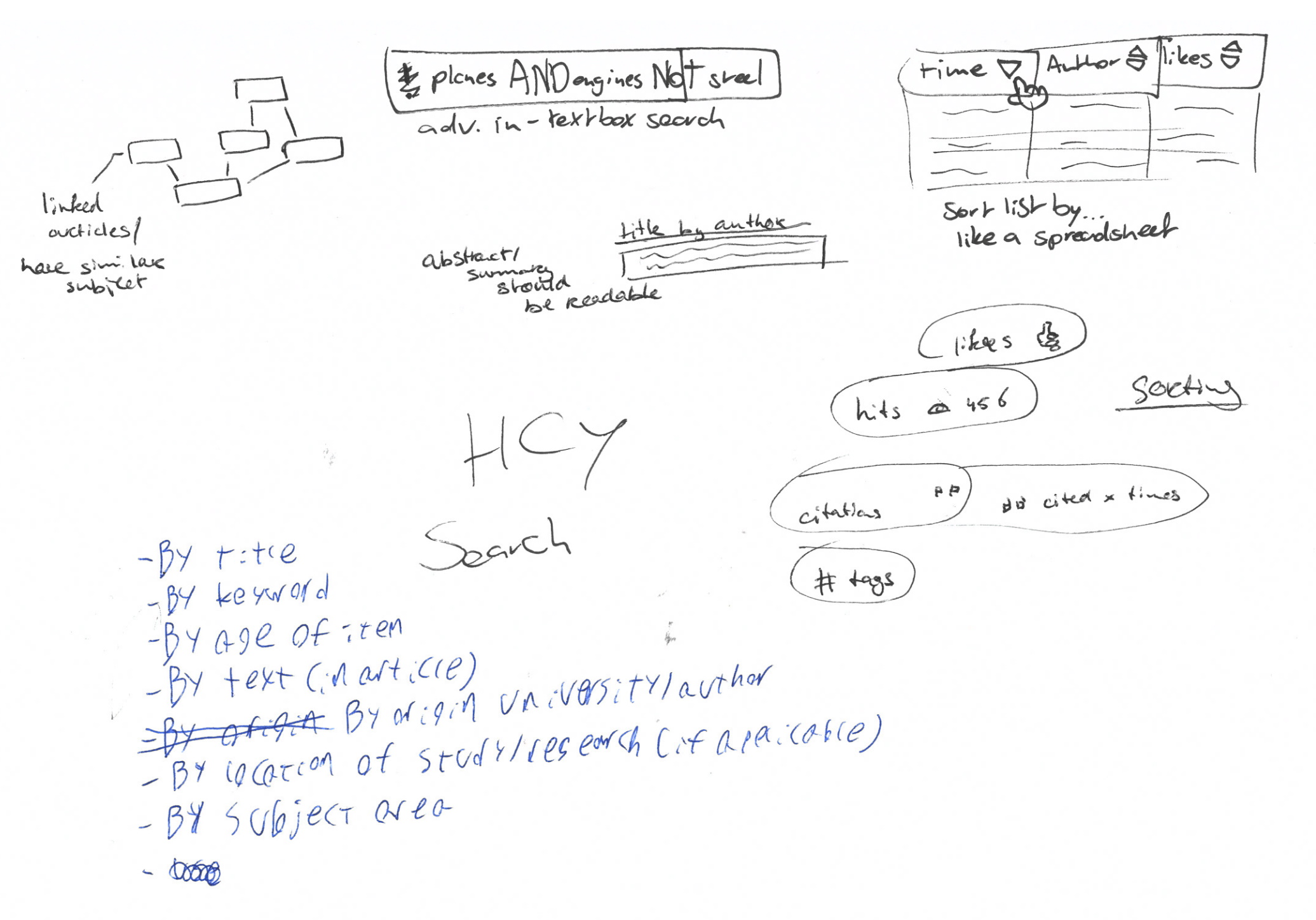
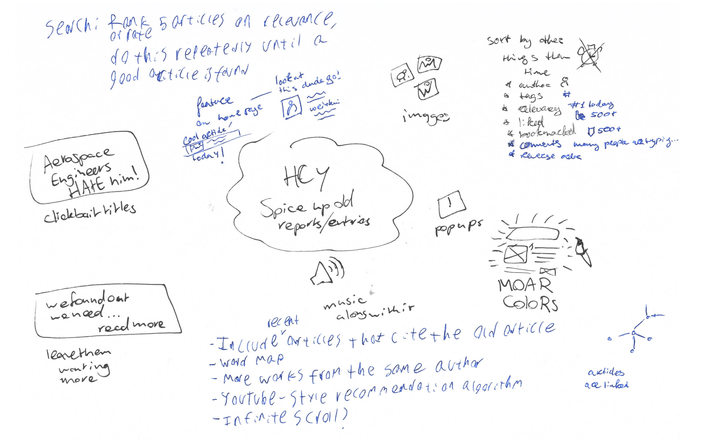
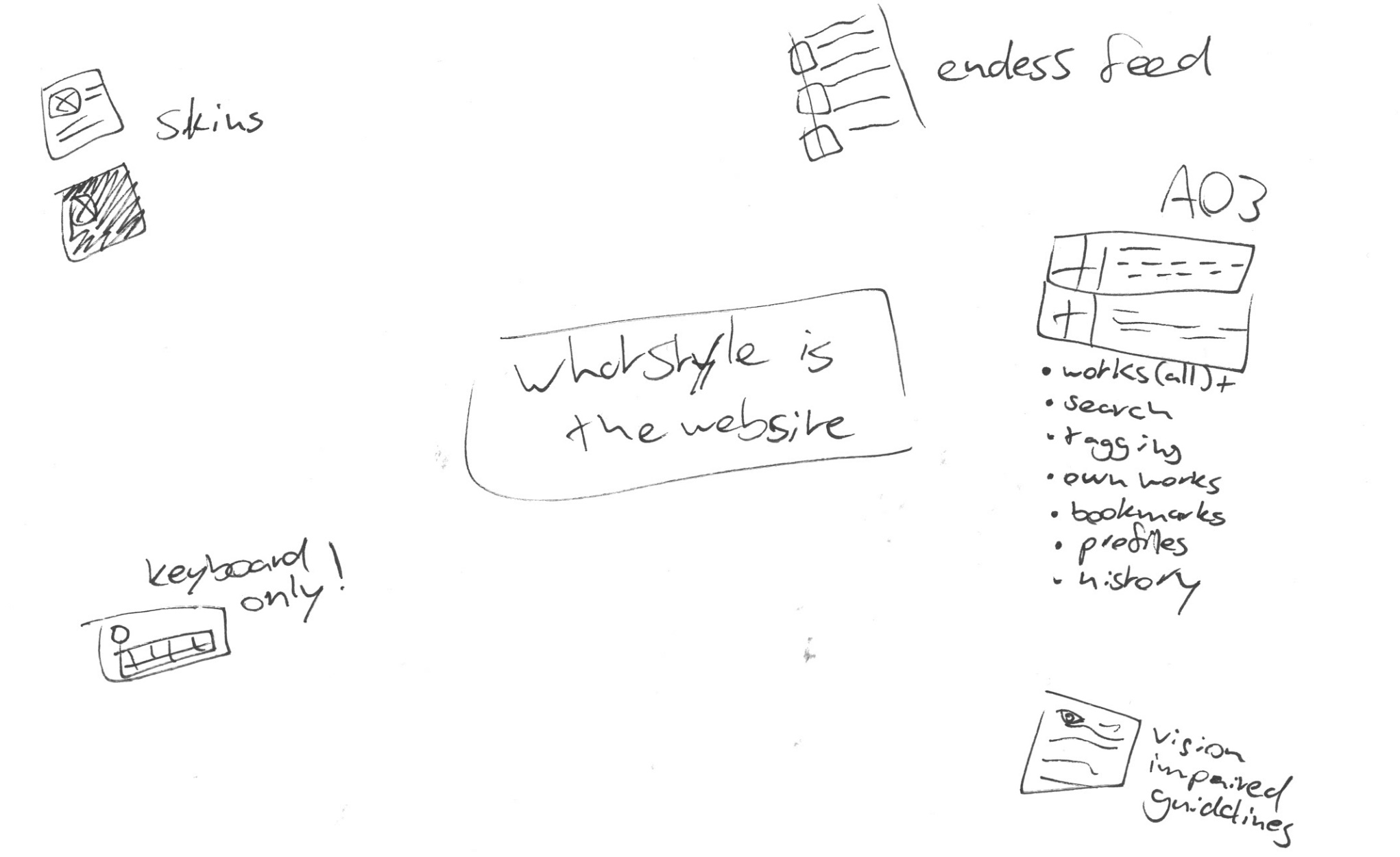
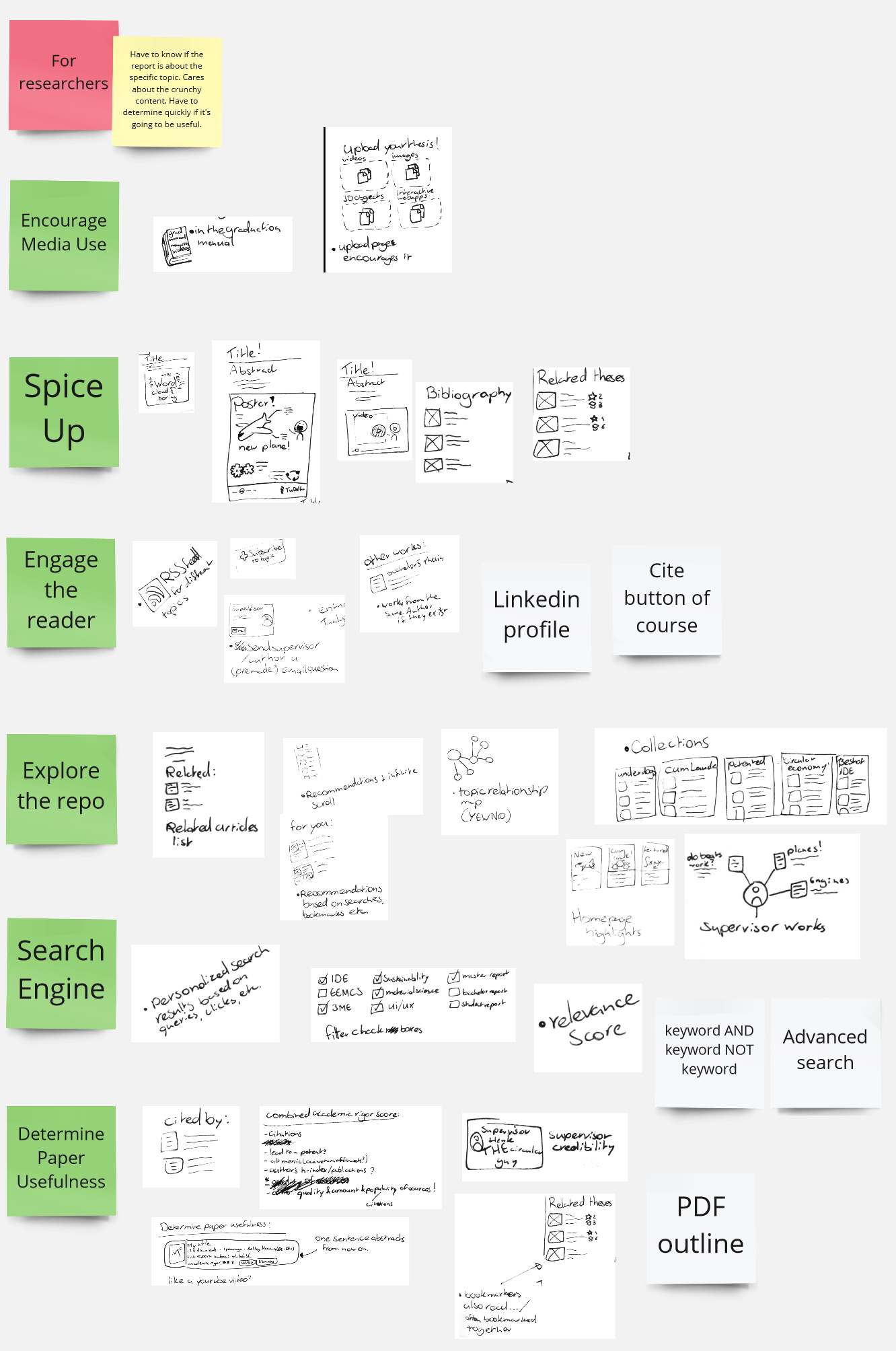
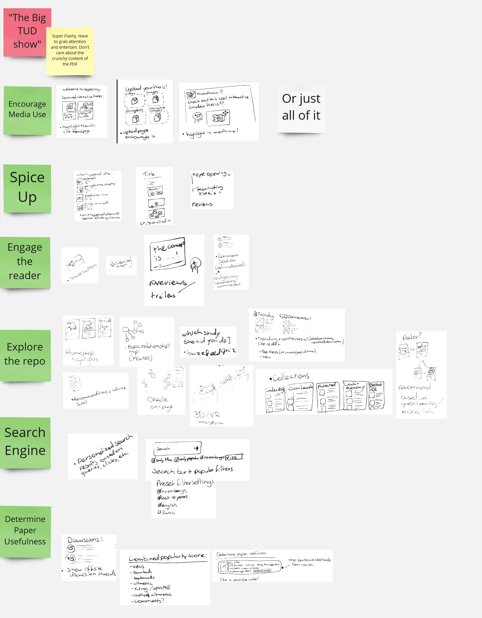
I made sure to explore a variety of different topics such as Determining paper usefulness, how to encourage media use, how to engage/fascinate the reader, how the reader can explore the repository, what sort of functions should be available for authors and readers, how the search engine could work, how to make existing reports more interesting, how to support interactive theses, and what concepts I could make.
How-to ideation session
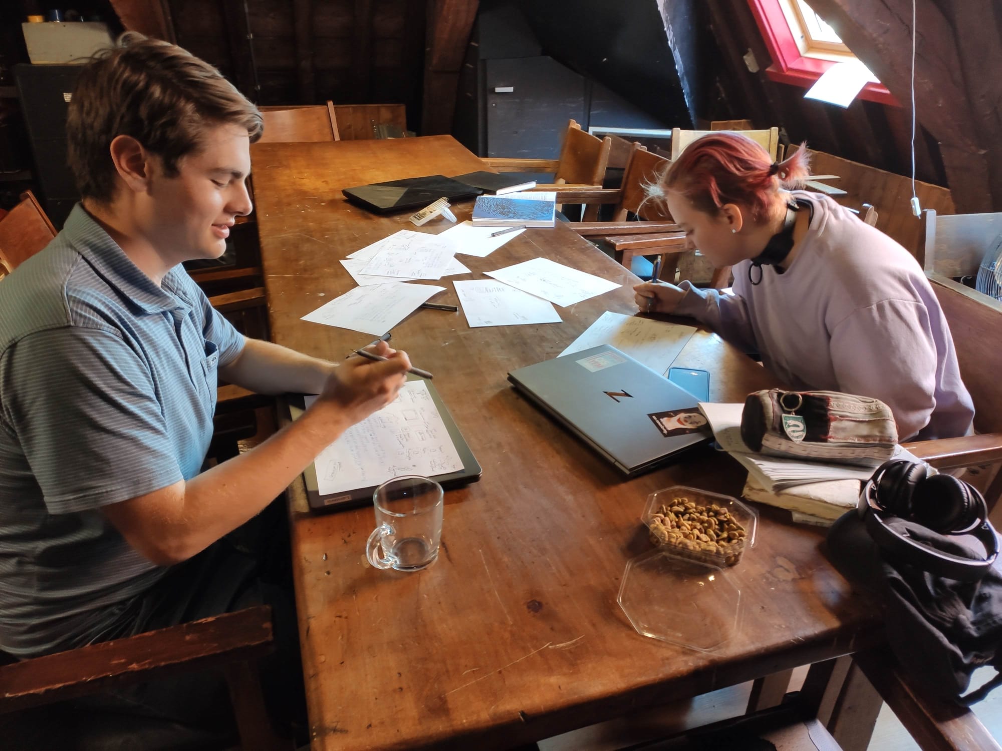
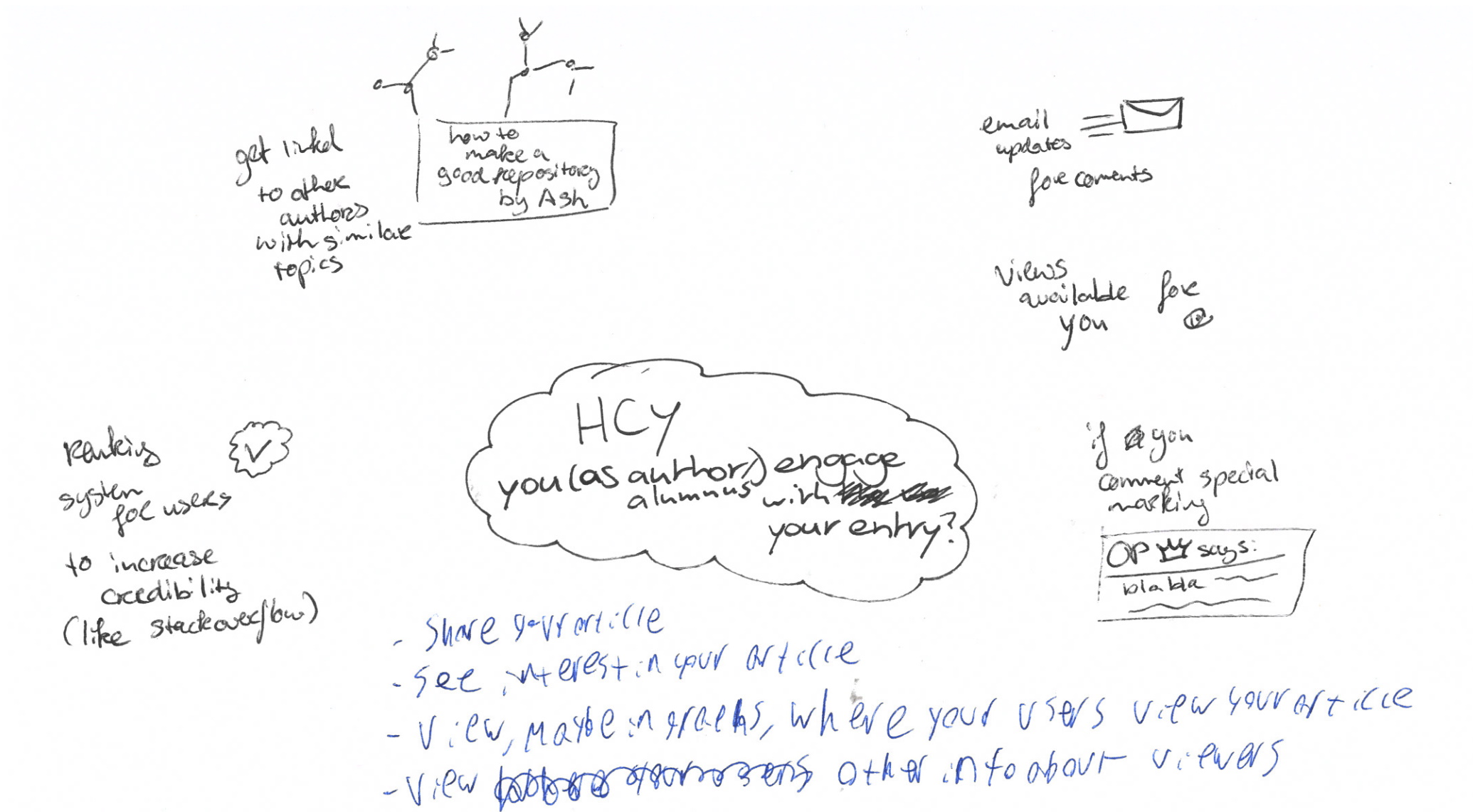
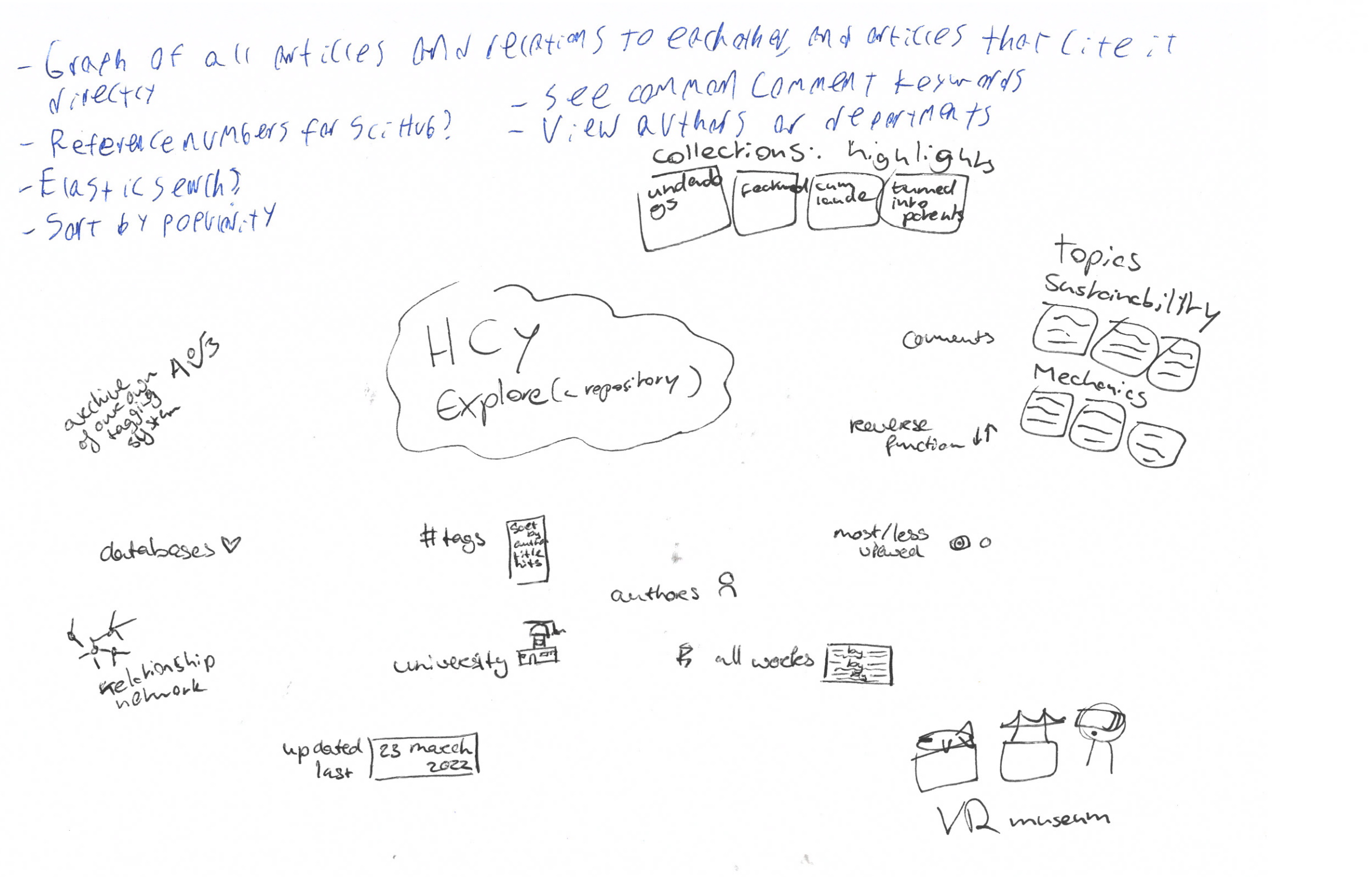
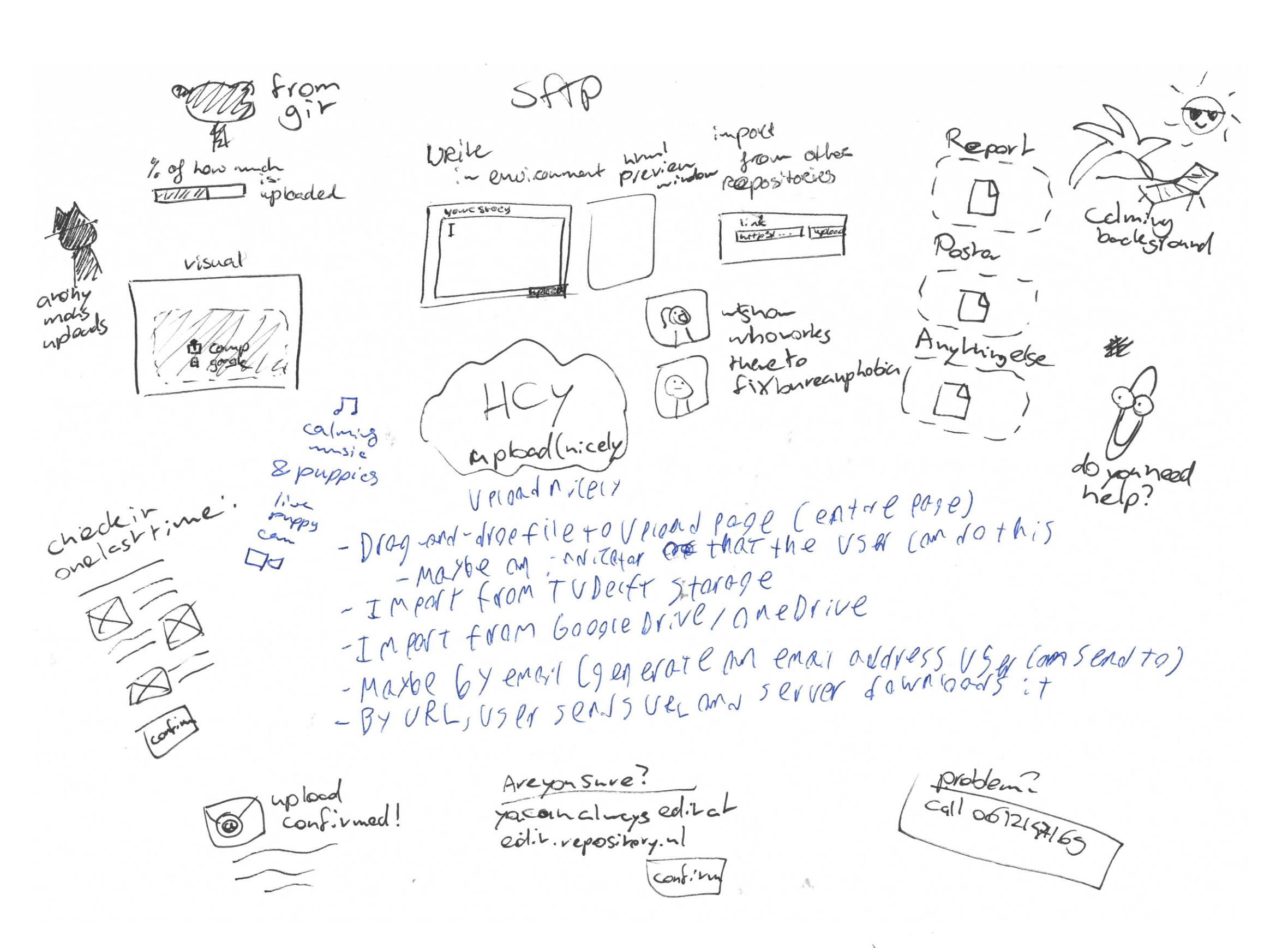
To generate more ideas, I did an ideation session with a computer science student, and a digital media development student. We used 'How-to's', where we written down topics such as 'how to engage with an article', and let everyone braindraw any idea that came into their head in 3 minutes, passing the topic along to the next person when completed. I later took the new ideas I've gained, and put them in my braindrawings.
(see Delft Design Guide p.175, 169, and 167 for more information the method)
Widget tryout
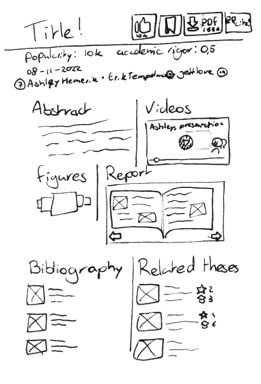
To get a better feel for the different ideas I had, I decided to make a mockup prototype of some of the ideas for widgets I could put on an entry's page, and see which ones would be interesting, and which ones would be redundant, or annoying.
open_in_new Visit the prototypeI felt like the wordcloud didn't add much to the entry page, as it's much better to look at a pitch or an abstract. I think the Bibliography personally doesn't add much, but some of my interviewees from other faculties thought it could be very useful. Related theses is an incredibly useful tool, and it's a shame it's all the way on the bottom. The PDF reader splits up the page, and makes everything below it seem like a footer with non-important information, this should be changed. The report file summary is only useful to an extremely niche subset of people, it shouldn't take up this much space. I've experimented with multiple ways of showing all figures from the PDF, and I think the small box where they're displayed in a grid view is the simplest, and also the best.
4 Concepts
Now that I have multiple ideas, it's time to put them together into concepts. I decided to turn my concepts into themes, which are focused on different users.
- ● For exploring students, with a focus on finding quality reports, and getting a glance of what's expected in a report.
- ● For alumni and scouts, with a focus on the author's achievements, skills, and how to contact them.
- ● For researchers, with a focus on a thesis' content, and its academic rigor.
- ● The big TU Delft show, with a focus on flashy media and interactive technology to 'Wow' readers.
Combining Ideas
I cut out the loose ideas from the braindrawings, and combined them for each concept if I thought they fit.
(see Delft Design Guide p.171 for more information the method)
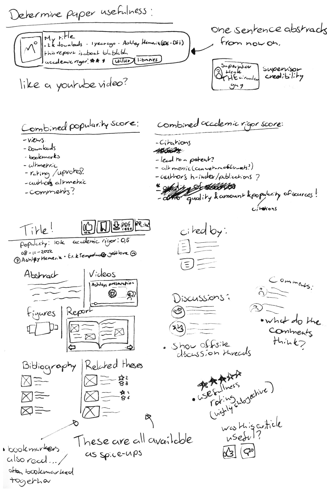
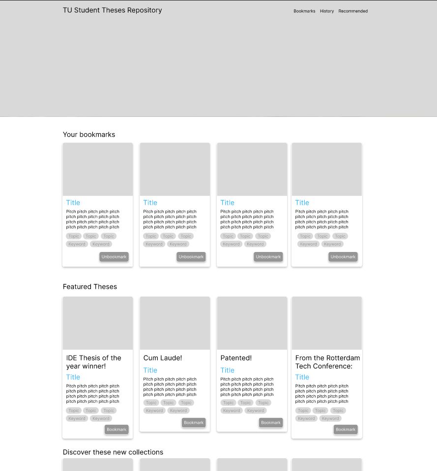
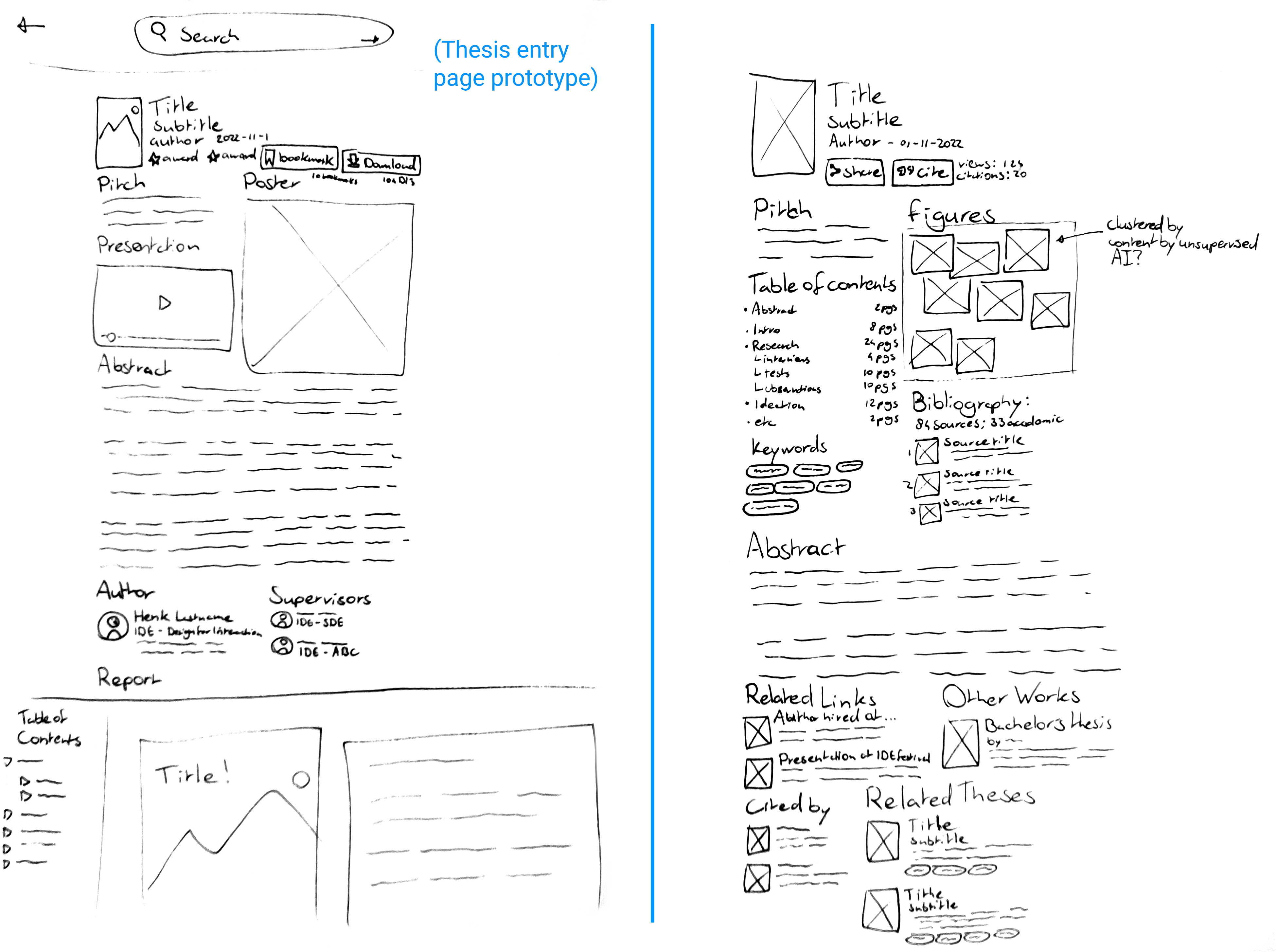
For Students
The biggest user group for the student theses repository is students who use it to see what's expected in a graduation report. These users want to find quality reports in their field, or reports with the same supervisor as them, and quickly get an overview of the outline, and quality of the content, so they know what to aim for with their own report, or graduation.
This concept features:
- ● Showing popularity in the form of views, downloads, and bookmarks.
- ● A project 'pitch', to help convey the content in a short amount of words.
- ● A table of contents, with the amount of pages dedicated to each chapter, so students can get a feel for what's expected in a report.
- ● The bibliography is shown, and the amount of sources, and how many of them are academic is shown, so students can get an idea of how much academic backing is expected.
- ● All figures in the report are collected and shown in a small window for a quick overview of the quality level of figures.

For Alumni & Headhunters
Your thesis is on the repository for a long time, and it's findable via google. This means that Alumni might want their entry to be something they're proud of, and use the attention it gains to their benefit, like when seeking employment.
From my interviews, I gathered that alumni were proud of their product and their presentation, but not so much of their report. It could be great to highlight their product showcases, figures, and presentations.
Headhunters also use the repository to search for new talent for their companies. They like to see recent graduates in a certain field, such as a master programme, or a student that graduated with a certain professor.
This concept features:
- ● Large section for the author, featuring relevant content from their LinkedIn profile
- ● Large sections for the supervisors, and a 'supervisor portfolio' for them, where headhunters can see who else they've supervised
- ● A 'related articles', or a 'what happened next' section, where the alumnus can show what happened with the report after they handed it in, for example, if they received any awards, if they got hired at the company they worked with, or their portfolio.
- ● An 'other works' section, that could include the author's bachelor theses.
- ● A comment section where people can say how great the author is.
- ● Highlighting the presentation video and product showcase, along with the report's figures

For Researchers
Sometimes, master theses are cited in other works. This concept is aimed towards people searching for information on the thing they are writing about, and to help them see if the report is both relevant, and validated.
This concept features:
- ● The abstract and keywords prominently on the top of the page.
- ● A 'Cite' button
- ● A bibliography like in the concept for students.
- ● A section that shows where the report has been cited already.

"The big TU Delft Show"
The TU Delft creates amazing, exciting, and inspiring work. I've been told that the repository was first set up to inspire and help high school students in their choice of bachelor programme long ago; And the Science Centre is aimed at young children, to get them excited about the topics the TU Delft programmes work with.
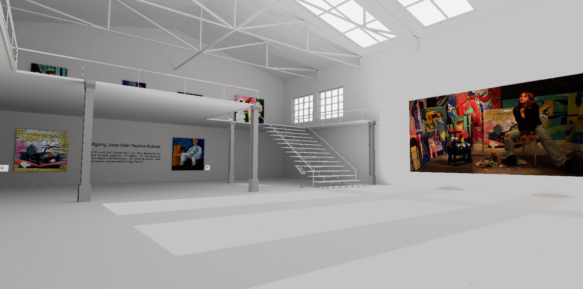
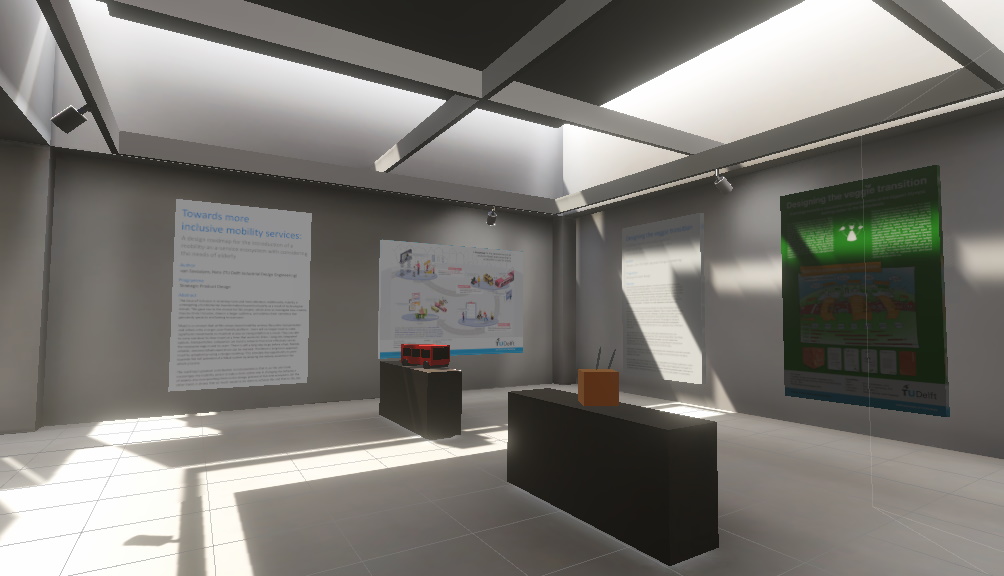
The student theses repository could become an exciting and inspiring place, where the most interesting and eye-catching parts of theses can be shown. To this end, I decided that this concept should become a virtual 3d museum, or gallery that the reader could walk through with their keyboard and mouse, or in virtual reality.
This concept features:
- ● A walk-through virtual gallery.
- ● Posters on the wall.
- ● 3D models on the pedestals.
- ● Text like pitches and abstracts can be shown as text plaques next to, or in front of the displays.
- ● Theses with 3D models, or other showcases will be highlighted.
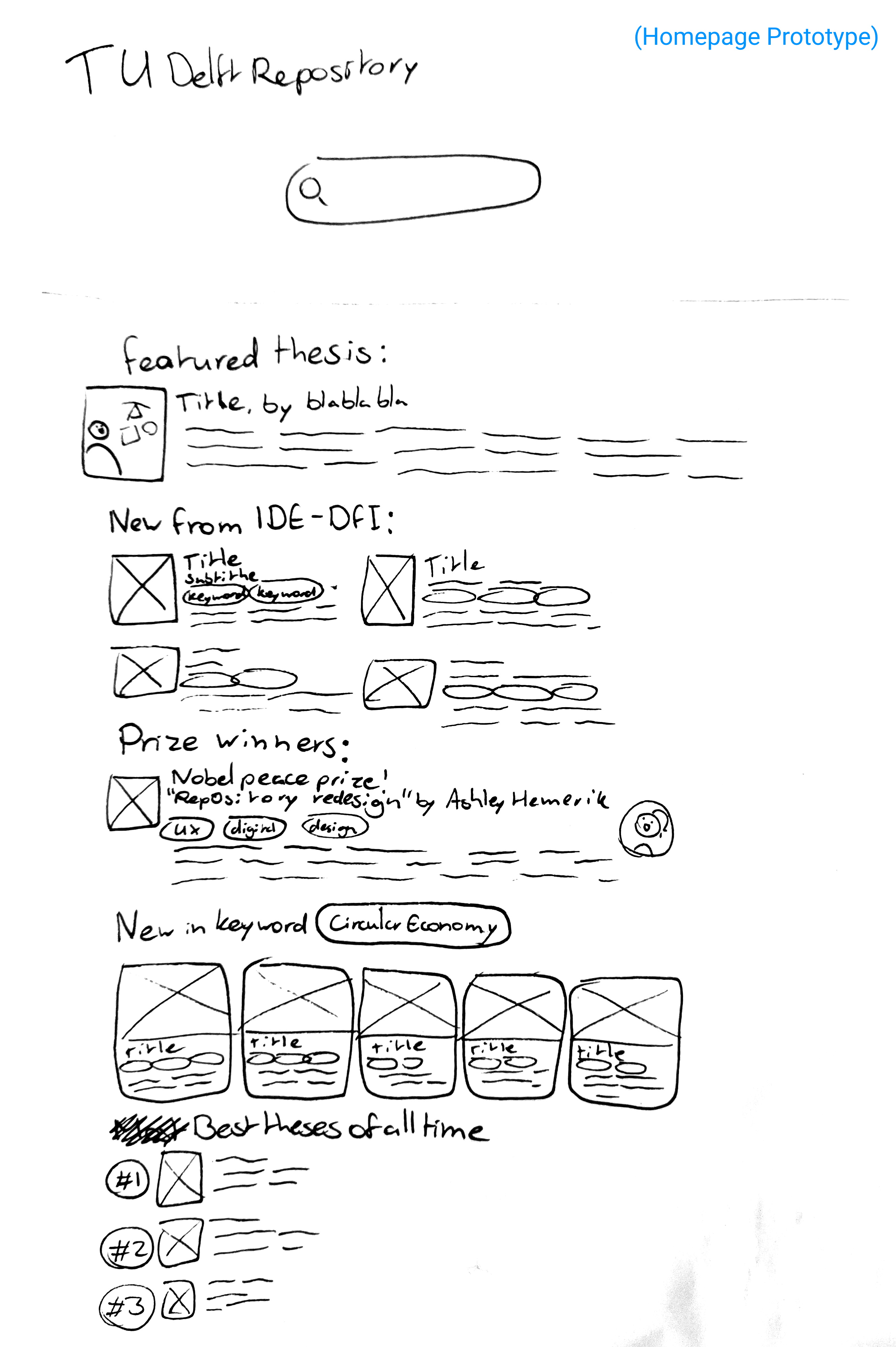
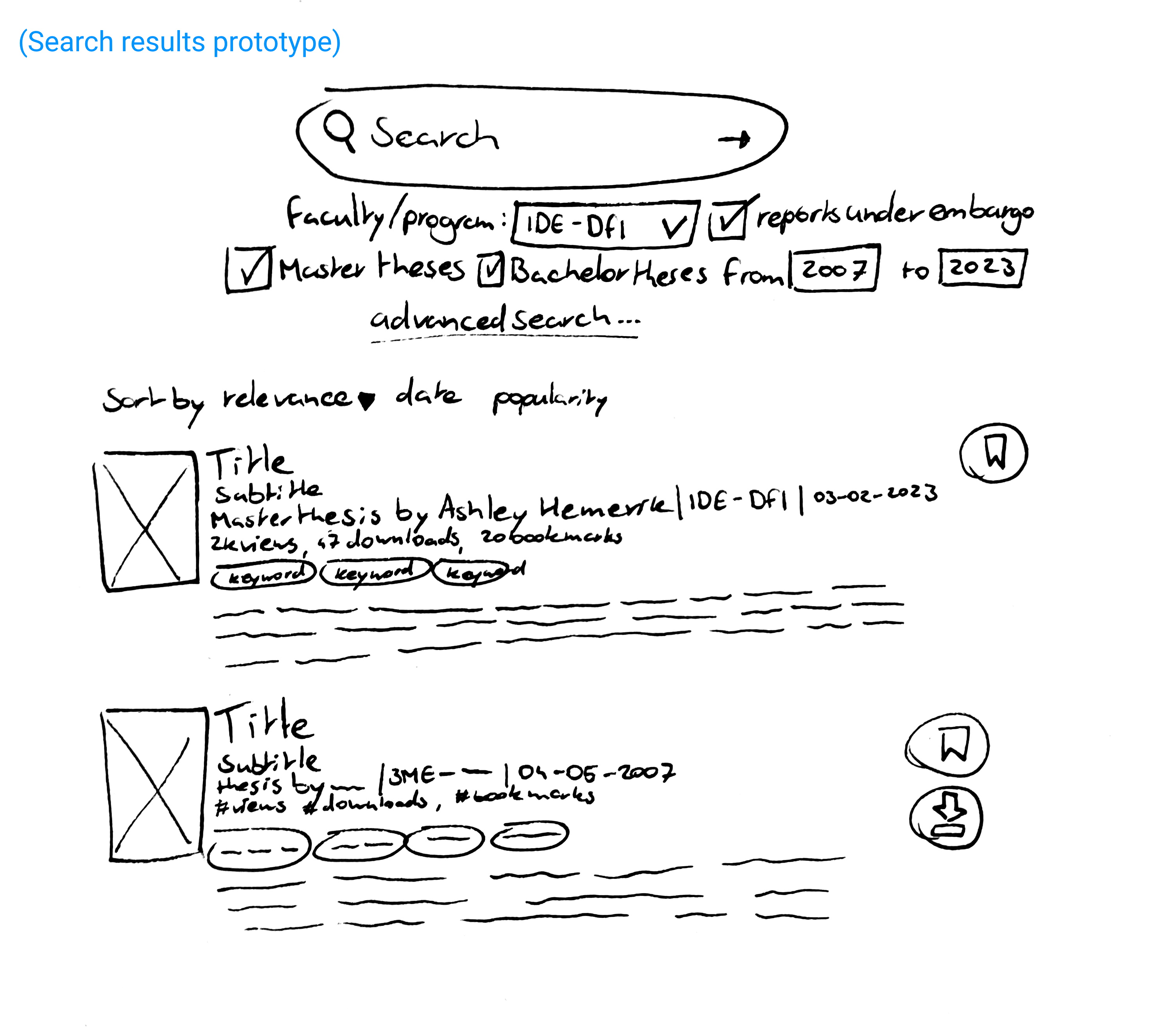
The homepage and search page
The homepage and search page will not be much different for the 3 website concepts. The homepage features collections of theses by programme, search query, keyword, whether they've won a prize, your bookmarked theses, etc.
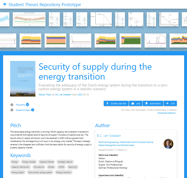
The search page features some of the most used filter settings right beneath the search bar, such as filtering by programme, including bachelors reports, including reports under embargo, and publishing year. The thesis previews contain a 'thumbnail' image, view and download metrics, keywords as clickable tags, and a short "pitch" .They can be sorted by relevance, popularity, or date.

The Figma Prototypes
For presentation, testing, inspiration, and validation purposes, I made some prototypes, both in Figma for the website wireframes, and Unity for the VR demo
Concept Wireframing
Figma is a wireframing tool that allows you to easily make mockups for user interfaces. I used it to sketch out prototypes for my concepts, that can be seen here.
click here to view it on Figma open_in_newTo explain the design choices I made in this prototype, I've created a video walkthrough of the design.
VR Museum mockup
I decided to quickly make an interactive mockup for the VR museum concept by downloading a 3D model of an art gallery from sketchfab and importing it into unity, with a few alterations to show some theses.
I have some experience with unity from trying to make videogames in high school, so this took only a day.
Plenary 'kick off the week' meeting with library staff
The TU library holds plenary meetings where people can show off their work, or other things that could improve the library in accordance with the Library Roadmap 2020-2024. About 50 people who work with the library showed up either online, or in person. I presented my concepts and gave them feedback forms with the questions:
- ● What is your function in the library?
- ● What concerns do you have about the concepts?
- ● What would you like to see in the new repository's design?
- ● Do you have other feedback / tips for me?
Feedback
I compiled the answers from the forms, and in-person feedback from the session. The concerns and ideas were:
- ● All layouts could be used and switched between, but that would require an extra click or login.
- ● The collections on the homepage could be shown in a more interesting way.
- ● Privacy: what happens to reports that people maybe don't want visible/findable on the internet.
- ● Broken links and interactive elements.
- ● Storage size and processing power.
- ● There is maybe too much information on an entry's page.
- ● An 'easy' upload process for students might mean more work for checking on the library's part.
- ● Someone's LinkedIn page is probably no longer relevant after 10 years
- ● A like button could turn it into a popularity context
- ● How much extra time is it going to cost the student and/or faculty?
(see Delft Design Guide p.93 for more information the method)
Concept selection
I decided to go with the concept aimed at students, because from my research, I found that they were by far the biggest user group. I can also include small things from other concepts into the final concepts if they don't overload the user with information, and can provide valuable information. In other words: a headhunter can still use the repository effectively if it's mostly aimed at students.
The Paper Prototype
New Requirements
The Library is looking for a new system. A team has written up a list of wishes and requirements for this system, which also impacts my design. The most interesting wishes and requirements are:
- General
- ● Requirement: The repository must be usable by people with disabilities.
- ● Requirement: profile page for authors (and contributors/supervisors?) with all entries and statistics.
- ● Wish: recommendations.
- Homepage
- ● Requirement: Collections.
- Search Results
- ● Requirement: Export metadata (.csv/BibTeX/RIS).
- Entry
- ● Requirement: A DOI for each object.
- ● Requirement: Viewable views and downloads, as well as advanced statistics viewable by the uploader.
- ● Requirement: Absolutely no comment section.
- ● Requirement: Licensing information must be displayed.
- ● Requirement: Removal request button.
- ● Wish: Request access on an embargo file.
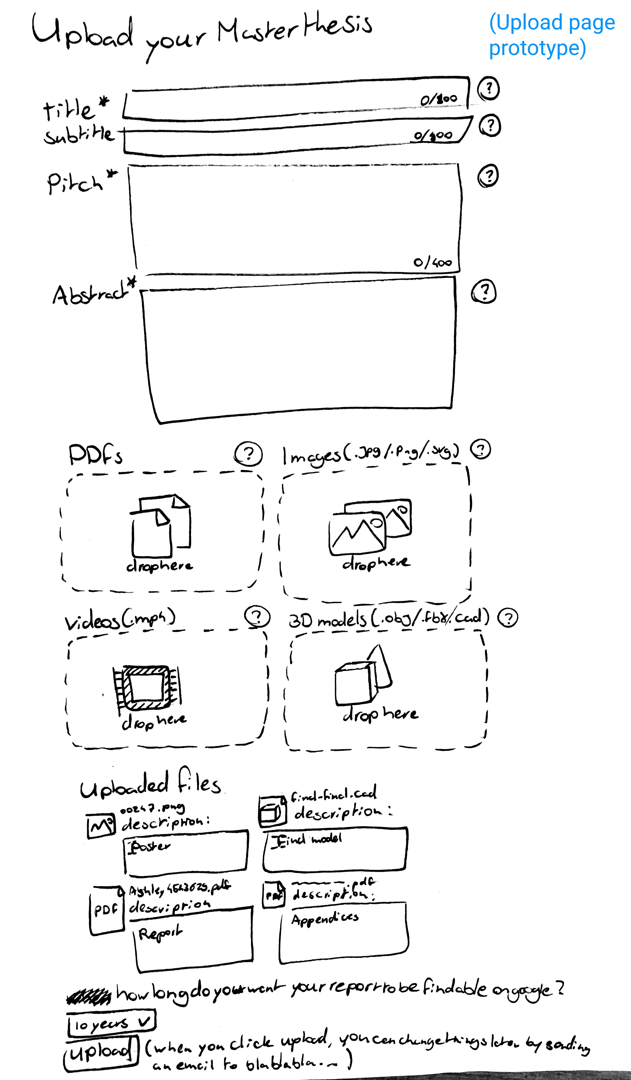
- Upload page
- ● Requirement: Choose licence for each object.
- ● Requirement: Choose embargo date for each object.
- ● Requirement: Save as draft.
- ● Requirement: Replace public files (old versions are still available).
- ● Requirement: Add objects to a collection.
- ● Requirement: Files up to 1GB.
- ● Wish: Upload any filetype.
- ● Wish: Metadata for each file.
Let's also review the most important needs of the other users.
- ● Filter via programme.
- ● Find supervisors by seeing what topics they do.
- ● Inspiration from previews (in user's field of interest)
- ● Filter via programme.
- ● Know if a report is of good(-ish) quality.
- ● Anxiety free uploading.
- ● Impressive content prominently on display.
- ● Hide unimpressive content.
- ● Filter by recency, programme, or supervisor.
- ● Advanced subject search.
The prototype
To start off with the iteration of the student concept, I made a mockup on paper. I chose to go for a low-tech solution on paper, even though I'm pretty comfortable with Figma, so the participants could see that they should comment on the content of the elements, not how big they are, or where they're placed.
I again made a video walkthrough of the prototype to explain some of the design choices I made
Feedback
I interviewed a PhD student who recently graduated, a software engineering master student, an applied psychology master student, and a Design for Interaction master student. I walked them through the prototypes, and asked for their opinions on the elements, and their overall concepts.
(see Delft Design Guide p.199 for more information the method)
-
note_alt 3ME PhD Student interview notes.#1 - 3me PhD student
New in keyword
Wil customizable zijn.
PhD theses er ook in, filter er op
Presentatie is een hele goeie
Bookmarks gebruiken hangt er vanaf
Mandalay - zou wss importeren in een reference manager
Bibliography een centrale rol!
Cited by is ook cool
Promoter, professor die er achter staat!
Cited by kan hoger, belangrijke metric van goedheid.
Libks after rhe fact and other works zijn minder interessant. Cited by bovenaan
Maximum characters in de abstract
300 pitch, 600 abstract
Images kan grafieken of graphic abstract worden
Optie voor graphical abstract checkmark. Dat word de thumbnail
Zeg: graphcial abstract optional
-
note_alt CGE Software Engineering master student interview notes.#2 - CGE Software Engineering master student
Reroll keyword
Like new in keyword
Best theses sounds weird
Rank by number of citations, don't like the word best theses
Filter for Dutch/English!!!
Not sure how often I use bookmarks, never use it on google scholar
Like number of views/downloads, like to sort by that
Click on keywords
Really like the supervisors, wanna see what they're involved in
Pdf viewer is nice, but maybe not important
Presentation is cool
Table of contents is not interesting, it's usually the same
Love keywords
How are you going to deal with things outside the repository
Figures
LinkedIn, Github is nice for related link
Cited by is not that interesting
Question mark help for all Things would be chefs kiss
It would be great to "save as draft"
Zip for the code would be great.
Or Link to Github.
-
note_alt Applied Cognitive Psychology master student interview notes.#3 - applied cognitive psychology master student
Good keyword search is important (AND OR etc)
Some filter on the homepage
Most cited/ Most viewed, not "Best"
Search by supervisor/ sponsor/overseer
Who does what kind of things is important
What does a thumbnail look like if there are no images
Featured theses and prize winners are overlapping
Change up the keywords
Instead of 'new', 'trending', or 'most impact'
'best of this year'
Overview of popular keywords
Trending keywords
Don't have too much on the landing page
Homepage should be 'stuff to get inspired by'
Suggested keywords based on searches
PhD theses in there please
"Peer reviewed"/"published"
Searching by faculty might not make sense
Just having the year might make more sense.
Put the DOI in the search results (for research purposes only)
Popularity values may bot be interesting to show
Good title + subtitle = no pitch needed
Keep the pitch as straight to the point as possible
There may be redundancies between title subtitle keywords and pitch
Search by supervisor, interesting for university internally as well
Grades would be relevant, some indication of quality.
Download button on the search results is not necessary
Page does not mean a lot (for a TOC)
Having a TOC overview is nice, but you may not be able to get a lot out of it
If they want an overview, they're gonna look at the paper
Related theses are good
Supervisors and related things they've done
Bibliography is not relevant unless you know what they're citing from it, depends on who uses it
Abstract first, not a pitch (having both feels silly)
If it's only 3 images, do it chronologically, if theres 100, cluster them
It might get a bit too crowded
If you're interested in other works, you'd click on the author
Bibliography is already in the pdf
Make it a multi-step thing, otherwise it would be overwhelming
Legal information, consent forms, etc.
Drag and drop is good
The help option for everything is good
Full data for reproducibility!!!
The bad theses will not show up if people are allowed not to show their theses.
-
note_alt Design for Interaction master student interview notes.#4 - design for interaction master student
voelt als spotify / netflix / reddit
interessantzou bij nieuw kijken. wat is actueel
best theses is handig als je al bezig bent, goed voor benchmarken, niet voor orienteren
zou al vrij snel naar de search bar gaan
weet al dat ie op critical design wilt afstuderen qua onderwerp
zoeken naar supervisors die daarmee te maken hebben.
cards layout is chill
add view more / clickable 'prize winners' title
zou niet downloaden vanuit preview.
keywords clickable in de search previews
(Maak supervisor profiel design !!)
Wat de author heeft gedaan is belangrijk voor familie en headhunters
Cited by, Related theses, en Bibliography is handig als je aan het benchmarken bent
TOC is handig om te weten of je meteen naar de conclusie wilt skippen
Cited By, Related theses, en Bibliography kan allemaal in één element
abstract en pitch kunnen er niet allebij zijn. (abstract mag weg, zit al in de paper).
TOC kan weg, of verstopt
Figures en de pitch doen ongeveer het zelfde, prefer pitch.
poster/graphic abstract is beter dan figures. Alleen als het
TOC en Bibliography samen voegen als "Report Statistics"?
Kan de views/citations/bookmarks/views verstoppen in een hamburger menu / uitvouwer.
takedown request.
AI generated pitch suggestion. -> AI generated pitch voor legacy reports.
helpt bij de privacy timeline.
vergeet embargo opties niet
Preview window in het uploadscherm
keuze voor display template in uploadscherm.
kleurcombinatie
The opinions on different elements varied greatly because of how different the expectations for the reports are in different faculties.
The main takeaway points were:- Homepage
- ● Choose keywords on the homepage, or show the most used keywords somehow.
- ● Add functionality to browse "new/trending/popular in keyword/faculty/programme"
- ● maybe a most cited/viewed/downloaded/bookmarked instead of 'best theses'.
- Entry page
- ● Presentation and poster/graphic abstract are very important, make sure they are on top.
- ● Add keywords on the supervisors to show what they're about.
- ● LinkedIn & GitHub links for the author would be great.
- ● Table of Contents and Bibliography could be combined into "report statistics(?)", and collapsed by default.
- ● No abstract and pitch at the same time on the page.
- ● No 'Other works' section. If you're interested in other works, you'd click on the author.
- ● Add a 'downloadable files' element to the entry.
- Search page
- ● A download button in the search result is not necessary.
The HTML Prototype
With the knowledge gained from the paper prototypes, I created a digital prototype in HTML showcasing 9 types of pages
I used the Materialize CSS library for a quick plug and play style solution that provides modern feeling, and allows for customization with my own CSS on top. I opted to go for a dodger blue color scheme, as it fits nicely with the TU Delft branding.
I again made a video walkthrough of the prototype to explain some of the design decisions.
Feasibility review with the library's senior developer
I went over my digital prototype with Andjela Tomic, the TU Delft library's senior developer, to check if the implementations of the ideas I've had was feasible. She said it was all very feasible, though some things might take more time than others. She was excited to build the concept for real, and warned me that the biggest challenge was convincing the bureaucrats to let us implement it, not the making of the website.
Feedback on the HTML prototype
I went over the design with three IDE students with experience in UI/UX design and who are either close to starting their graduation and orienting themselves, or have already started and are interested in benchmarking their theses against others, and let them speak about anything that came to mind for them. Most of the feedback points were very specific, and about the layout, which is a good sign that the general idea and design sensibilities work.
(see Delft Design Guide p.199 for more information the method)
-
articleSee Notes of test 1Award geeft goed aan dat het een goed report is
Bookmark is handig
Voor een reference zou het handig zijn om een score per ding zoals bijv layout, research etc.
Haal most popular weg, gaat verouderde data geven
Bookmarked verder bovenaan
Kijk naar hoe netflix het doet
Klikken op persoon profiel is nice
Klikken op supervisor zou moeten zeggen wat ze daadwerkelijk doen in de faculteit (belangrijk!!)
Icon in de search om embargostatus weer te geven is niet intuïtief
Downloads en bookmarks zijn misschien een beetje hetzelfde
Meer emphasis op title keywords summary
Misschien in de thumbnail een "only for logged in people" icon erover ofzo
Checkbox for only for logged in
Sort by: in dropdown menu, of underline
Positie van de popular keyword voelt als filters, misschien onder de zoekbalk
Supervisors in de zoekresultaten voelt als advertentie
ENTRY
Keywords boven abstract is niet standaard
Hoveren over supervision availability gebeurt niet
Links en cited by afstand mag groter
Poster word waarschijnlijk groter
Aparte layout voor landscape en portrait
Popup abstract voor related theses is kut
AUGMENTED ENTRY
grotere "ga naar de website" knop, iframe is een beetje kut
SUPERVISOR
availability moet groter
Similar profiles mag groter
Meebewegen voelt onnatuurlijk
PROGRAMME
side by side voor trending, popular, new is niet handig
Recent graduates is leuk
KEYWORD
Bookmarked in (keyword)
UPLOAD
Verplichte opties moeten nooit eens standaard optie preselected hebben
Vraagtekens naast se woorden
Programme verder naar boven
Upload de thumbnail veel hoger en in separate
Men weet niet wat een "pitch" is, misschien een description noemen
Apart uploadveld voor thumbnail, graphic abstract, report
Upload de bibliografie als je het toch al kan copy pasten
Contributor columns voelt scheef somehow
Nieuw toeveogen bovenaan
Meerdere dropboxes is goed!
Embargo per file onder een "extra opties"
Also upload your profile misschien als volgende pagina
Request copy button op verwijderde theses
Check entry preview AND SAVE AS DRAFT
-
articleSee Notes of test 2Homepage
Eerst master dan onderwerp is nice
Goed voor als je aan het oriënteren bent en niet weet waar je op moet zoeken
'wat is under embargo?'
Search
2 reports 2 supervisor
Checkmark hovert ie niet
Zou niet naar de rechterbalk kijken omdat daar vaak ads staan. Moet meer prominent gefeatured worden
Program
Theses links, mensen rechts
Recent graduates is misschien nice voor ouders op zoek naar hun kind
Entry
Pitch alleen in search preview
Wat staat er in advanced statistics?
Voelt heel intuïtief
Het presenteert vanzelf met informatie als je blijft scrollen, dus je hebt geen ervaring nodig
Het zou overweldigend kunnen zijn met hoe veel je op kunt klikken
Often used keywords in program
Similar profilew moet similar SUPERVISOR profiles
-
articleSee Notes of test 3Log in moeilijk te zien
New in program voelt groot en niet als een titel
Het voelt niet als een bibliotheek, maar als een nieuwssite
Bookmarkedpagina
Bookmarked op hoofdpage
Maak alle afbeeldingen 1 size
Title subtitle in cards
Related keywords is fijn
Search
Supervisors in search voelt out of place
Maak het een filter check
Icoon eerst, dan de text
Entry
Stats en prizes geeft goede snelle indicatie van kwaliteit
Lezer geintegreerd is nice
2 kolommen is soms druk, niet einde van de wereld
Programme
2 kolommen storen hier minder want ademruimte
Supervisor
Similar profiles is nice
Moet op keywords, faculty, en availability
Laat supervisors theses uitlichten
Upload
Textfields langer
Upload fields meer prominent?
Also upload your profile standaard ingeklapt
Privacy enddates onder een advanced button
- ● awards work, make more (previously featured or something)
- ● supervising availability needs to not be an icon, but text
- ● icons for "no pdf viewable" or "login required" don't work, spell it out (maybe grayed out until viewable). maybe gray out theses you can only access if you're logged in if you're not
- ● privacy settings per file needs to be in an "advanced privacy settings" section
- ● (in programme) put theses on one side, people on the other
- ● supervisors should be able to feature/comment on theses they're proud of
- ● special upload field for report PDF, thumbnail, and Graphic abstract/poster
- ● the 'recommended' section can be featured more prominently.
- ● add 'often used keywords in programme'
- ● adding supervisors to search results should be optional (a check under the searchbar)
- ● 'Sort By' in a dropdown menu
- ● pop up for the abstract on related theses sucks, give it a timeout before it pops up
- ● a bigger 'go to website' button for augmented entries, disclaimer that the TU is not responsible for the content.
- ● Upload field for iframes and other embeds so user can put things like sketchfabs in there
- ● make the help icons closer to the titles, not floating to the right
- ● add an upload field for a bibliography
- ● already open a field for add supervisor.
- ● "check entry preview" also needs to save as draft.
Final Prototype
The final prototype has a few minor changes compared to the HTML prototype, as suggested by the feedback from the previous prototype's tests. The biggest change is that it loads random thesis metadata, such as titles, subtitles, names, etc., into the placeholders to show what the design might look like when it's deployed in the future. Because they are random, they do not always make sense (for example, an applied physics thesis might show up under an EEMCS award.)


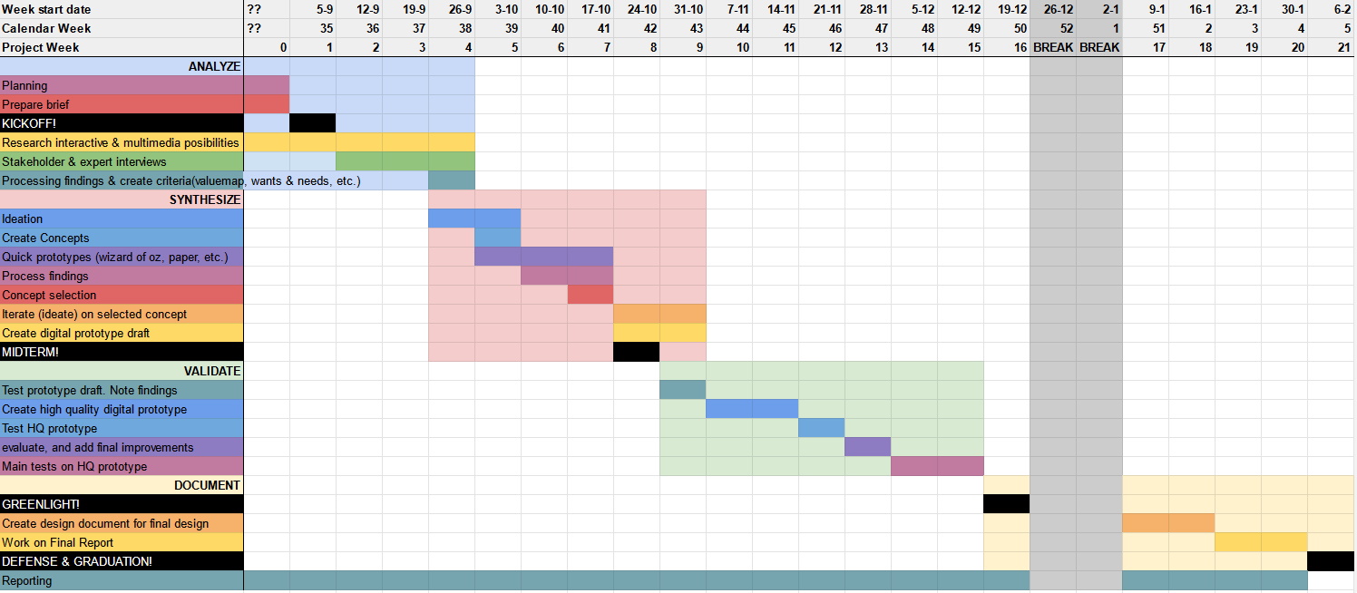
Evaluation
Since the final prototype was not that much different from the previous one, as well as due to time pressure, I decided to make an online questionnaire that guides participants through the online prototype, and asks open ended questions to see how they feel about it. The main takeaways were:
- ● There was a lot of positive reception to the overall style and functionality of the different pages and elements.
- ● The layout and design can be slightly altered to improve readability.
- ● The supervisors within the search page feel a bit off.
- ● The search filters need a more logical structure.
- ● People felt uncomfortable with the idea of author/student/alumnus profiles
- ● The length of the upload page is what stresses people out. If it can be shortened, it should.
(see Delft Design Guide p.199, and 93 for more information the method)
See the questionnaireopen_in_new downloaddownload the questionnaire resultsDesign Document
The front-end that I designed still needs to be implemented. That task will likely take weeks or months, a lot of unforeseen problems will arise, and adjustments will need to be made. That is why I decided to make a short design document, in which I explain my design decisions, and the order of importance of the new features I designed, so it is clear which need to be implemented first to have a minimum viable product. I decided to keep it short since I already will have this large report, an interactive prototype, and many video presentations in which I go more in-depth. The report contains a MoSCoW order of feature importance, and annotated screenshots with the design decisions.
Marketing, how do we get people to use it?
The new front-end will make it much easier for students to orient themselves in what a graduation report looks like, to benchmark their report against comparable reports, and to show off their report once they've graduated. But that is all useless if the users don't know about this new functionality.
The target audience is students right before, and during their graduation. Currently, students aren't very aware of the existence of the open repository. They usually find out through supervisors who recommend the reports of alumni they supervised earlier, or they recommend benchmarking to the student when they're starting to work on their report. However, not every supervisor does this. The supervisors could be informed about the new design using posters hung in the hallways of the faculty offices. This would also reach the graduating students who often have to walk through these hallways to talk to their supervisors and experts on their topics. Posters could also be hung in the regular study rooms of the faculty, or be displayed on the TV's that show slideshows in the faculty.
The library is the home of the repository, and the place where TU knowledge is archived. It makes sense to hang posters about the updated design around the library. The people who work at the front desk of the library could be informed about the efficacy of the repository should someone ask around for books, or other knowledge. The library is also working hard on showing the wealth of digital knowledge besides the book wall with the Oracle project. This is also a great place to advertise where students can dive deeper into this knowledge on the repository.
Students get mailed a lot of monthly emails, such as from the study association, the faculty, the board, and more. the updating of the repository could be added as a news item to one of these emails. The TU also has a journal called the Delta. A news story in the Delta could reach students as well. Some podcasts are also aimed at TU students specifically, an interview in one of these podcasts could give the new design some exposure as well.
A place where specifically students who are (almost) graduating gather, is courses and workshops aimed at these students. For example, IDE has an elective course called Initiate to graduate , as well as the graduation community. If the organisers of these courses and initiatives are informed of the new design, they can recommend, or challenge their participants to use the repository.
Conclusions
Answers to the research questions
"What types of (interactive) media can be useful for reporting for the different majors?"
Master programmes that deal with experiments, like, for example, applied physics, can use videos of their experiments and setups to great effect, as well as downloadable results files, or interactive graphs. Programmes more heavy on the engineering side can use CAD, and other 3D models for different drafts up to the final design. Programmes with software models for modeling what would happen in real life can have the model displayed as a downloadable file, or have a web-ui for the viewer to play with straight away. Computer science programmes can have the works they made downloadable as zip files, or displayed in an online IDE; links to Github for any of the libraries used can also be provided. For myself (Design for Interaction), I used interactive software prototypes that user can play with directly. (see 'what can we do with media?')
All of these uses of media make the theses more interactive, and more understandable for those who cannot, or don't want to read and understand a full report.
"How do we encourage students and alumni to add (interactive) media to their reports / the repository?"
Students already have an innate drive to make their reporting more interesting with media. However, because the system only supports PDFs, students get discouraged, or they don't think of multimedia reporting as an option. The hope is that making the repository support different ways of reporting, such as via websites, but also by adding multimedia to the thesis entry page, will put multimedia reporting on the map as a great alternative for traditional reporting. (see 'interviews')
Students gather a lot of data during their graduation project, such as videos, photo's, CAD drafts, data tables, etc.. When uploading their thesis, they will be invited by the upload page to attach a lot of different files of many different file types as well. Displaying dedicated upload fields implies dedicated support for these file types, and since the uploading student already has these files on their harddrive, it will be an easy decision to add them. (see the upload page)
The largest group of users are students who have started, or are about to start their graduation project. This means that if these students see the already uploaded multimedia reports, they will be aware, and inspired by the possibilities of multimedia reporting, and improve upon it further, creating a positive cycle. (see 'who uses the repository, what do they need?')
"What do these new (interactive) multimedia reports look like?"
The main way of reporting will likely stay PDFs for a while. Media can be added to the front page of a thesis report, allowing users to interact with the content outside of the report, likely before reading the report itself. An addition of links, and downloadable files will provide an easy way for the reader to play around with the products of the student's labor, such as someone downloading the source code of a software model and playing around with it, or downloading collected data from an experiment and using it for their own. An example of this can be seen in the thesis entry page prototype.
For full-website reports, the beauty is that it will be completely up to the creator what, how, and when they want to add any type of media. My report is a full-website report, and I used images that users can zoom in on easily, interactive online prototypes users can try out for themselves, and video walkthroughs for the prototypes I made, internal and external hyperlinks for sources and substantiation of claims, along with a lot of other things. Atula Jadhav used animations and deeper information behind mouse-hovering and clicks, and many other interactions in her full-website report. These are just two examples. Beyond-PDF reporting can take on an infinite number of appearances, and I'm excited to see what students come up with in the future.
"Is there a way to (programmatically) add multimedia elements to already published reports?"
PDFs already contain some types of media. Mostly in the form of metadata, images, links, and text. Images can be extracted from PDFs, and displayed in a 'figures' section. Links can be extracted as well, and metadata about these links, such as page titles, descriptions, and preview images can be fetched to display these links with more information. Some reports are already uploaded with videos or images attached. These can be displayed in their own on-site viewer as well. The current archiving software also allows for map coordinates, and data links, which can be displayed in a google maps widget, or 4TU data viewer widget on the thesis entry page. Metadata such as titles, subjects, and study programme can be used to show related theses on the entry page.
The text of a thesis can also be used, but for less interesting purposes. The full text of a report can be turned into a wordcloud programmatically, which could give an indication of what terms are going to be important in the thesis. The abstract can be summarized by an AI into a an even shorter 'pitch' for the project. And the outline of a PDF can give information for advanced statistics on a report, such as chapter lengths, word count, etc..
Currently, the first page of a PDF is used as the preview image for a thesis. This can still be done. I've also talked about using the title of a thesis as a prompt for AI art generation to generate thesis covers, but I haven't explored this. (see 'what can we do with existing reports?')
"How do different users use the repository? What are their wants and needs?"
Most users fall in the following categories:
- ● 'Orienting students', who haven't started their graduation projects yet, but they're looking into what a graduation project might look like, what subjects they might be interested in, and what supervisors they might like, and if they are available. They want exemplary reports for their masters programme/topic.
- ● 'Benchmarking students', who are currently busy with their graduation projects. They're looking at similar topics and reports to theirs, so that they can compare, get inspired, and see what's expected of them. They want exemplary reports for their masters programme/topic.
- ● 'Reporting students', who are writing their report, and want to convey information. The repository must support their needs as best as possible via multimedia support.
- ● 'Uploaders', who have to go through the upload process during a very stressful period. The design needs to help them feel less anxious with clear communication and a transparent process.
- ● 'Targeted downloaders', who know exactly what report they want to download. They want to get to it quickly, hit download, and leave again.
other users include:
- ● 'Alumni', who want their repository entry to be something they can be proud of, and have control over what information of them is on the website after they've graduated.
- ● 'Supervisors', who want to show off their supervisees' works.
- ● 'Headhunters', are rare, but also use the repository. They want to find recent graduates from certain masters programmes, or supervisors.
- ● 'Researchers', often use external search engines like google scholar, but do happen upon the repository. Abstracts, keywords, quick downloads, and reports similar in topic are important to them.
"How can the design of the repository and its search engine support those usecases?"
The repository doesn't show the grades that theses have received, however, good and exceptional theses can still be highlighted by using view and download metrics over time to allow for sorting by popularity and trending. Some faculties also give out awards for best theses. These theses can be featured on the front page, and receive a badge. Supervisors can highlight a thesis they've supervised as well. This way, orienting and benchmarking students can still find out whether or not a report is exemplary. Topic keywords, preview images and shortened descriptions have been added to thesis previews, which will allow people to quickly gauge interest. (see home page)
Filtering by study programme has been made a lot easier, and these programmes will get their own page. This will help students and headhunters find theses that interest them much easier. (see programme page)
Supervisors will now have their own page with what they do, and what they've supervised on it, as well as an estimation of whether or not they're available for potentially supervising your project. (see supervisor page)
Support for many different file types and types of media is added, which will allow students to communicate their project, and readers to experience projects, in wonderful new ways. These multimedia thesis entries will be something Alumni can be proud of. (see entry page or full-website entry page)
The upload page has better explanations for the upload process, and explanations of what's going on behind the screen on it now, as well as useless options removed, or already filled in. This will help with anxiety for uploaders. (see upload page)
Abstracts and keywords will remain and will be more prominently displayed. A cite button will be added for the reasearchers, and a download button at the top will be added for the targeted downloaders. (see entry page)
"Does this new repository design fit the wants and needs of its stakeholders?"
While I was not able to gain feedback from every type of stakeholder, the main stakeholders were all very enthusiastic about the new features and the design of the new repository.
Discussion
There are still some things that can be improved on the current design. For example, the interface sometimes feels a bit cramped and could use some extra padding and white space here and there, the search filters might make more sense if they're on the right side of the screen in the search page, and there will be even more problems that will come up once the design is implemented and users start using it.
I think adding profile pages for authors/students/alumni might have been a mistake. The work should speak for itself, and having only a first and last name would likely by enough already. Most alumni wouldn't likely not want their profile on the repository, as it will quickly become outdated as they grow in their careers.
One small problem with the supervisor profiles is that the keywords that get added to the theses they supervise likely won't show up more than once in their supervisor portfolio. I've also been told that supervisors like to take on projects that don't fit in their area of expertise at all, which means that supervisor keywords might not be a good way of getting an idea of the supervisors' deal. An alternative might be using the fingerprint from the research.tudelft website, or to let them, or the secretariat fill these keywords in manually when they edit their about page.
I also think that giving the option of a temporary publication window for uploaders may encourage it too much, when the goal should be encouraging uploaders to publish it indefinitely. I think the alternatives I've provided, such as availability only to other students and TU personnel, and not listing the thesis in a search engine, in addition to reassuring the uploaders with the takedown request button should they change their minds later, should already change a lot of uploaders' minds. Furthermore, I think it may be better to think of a way to encourage publishing your thesis, such as a free coupon for the on-campus coffee company, or something like that. I wish I had more time to explore this.
Another issue is that of data longevity. Links expire and servers go down. When a lot of the media about the thesis is hosted on other sites, knowledge can be lost when a site goes down, or links break. The internet archive and its 'wayback machine' is one way to archive webpages, but this has its limitation. Hosting media on the TU's own servers can be another way to solve this, but hundreds if not thousands theses get added every year; all of that media would need storage. Since one of the requirements for the new system was 1GB per per theses, I've assumed that as a maximum, but knowing how much storage space the TU would need for this, is outside the scope of this project.
There are also a lot of different Ideas I would have liked to have more time for to develop. These include showing related keywords after entering a search query to help users find the right terms when searching; knowing what metadata to add to different types of media, as well as the thesis itself, to aid in searching and finding related theses, or searching directly for media; having a big list of supervisors for a particular faculty, and making it a dedicated page for students to find the right supervisor; generating cover art for theses without them using AI, and the metadata is input; and integrating supervisors more into the workflow of what ends up on the repository.
Self Evaluation and What I've Learned
I'm proud of the design I've made, and I feel like I can do a lot more to improve it, and answer questions still left up in the air if I would have the time (see discussion). I would love to redesign the upload page when I knew more of what will be possible with the new back-end software, what metadata it absolutely needs and what it doesn't need, and with how the users feel about it. I'm proud of my exploration of multimedia reporting, and I think that this will become the new paradigm in science communication and reporting. I'm glad I got the chance to talk to and convince teachers at the TU Delft about this.
I've learned a lot about working for a company that isn't a design studio. I was very surprised that the TU Delft library didn't have information on who uses the repository, as that would be the first thing a designer would ask. I'm proud of my research process, and building this knowledge of the users from the ground up, without any usage statistics. Doing interviews and meetings is quite hard for me, but I've learned to do it a lot better over the course of this project. I've also learned that planning and having meetings is something that happens a lot at the TU Delft. At first I was honored that so many people wanted to speak to me, but I learned quickly that if I said yes to every meeting, that I would no longer have any time left to do my work in.
References
mailRequest access to full interview audio/video| Name | Link |
|---|---|
| TU Delft (2023, January 26). TU Delft student theses repository. Retrieved from https://repository.tudelft.nl/islandora/search/?collection=education | link |
| Clare, C (2021, November 3). Rethinking the library repository: a focus on masters' and doctoral theses. Retrieved from https://openworking.wordpress.com/2021/11/03/rethinking-the-library-repository-a-focus-on-masters-and-doctoral-theses/ | link |
| Heles, D (2021). Q&A: Islandora Upgrade. Retrieved from https://lyrasis.zendesk.com/hc/en-us/articles/360059419231-Q-A-Islandora-Upgrade | link |
| Jadhav, A (2022, March 8). Morphing Matter. Delft: TU Delft. Retrieved from http://resolver.tudelft.nl/uuid:98be37d9-3cdd-460f-b5b4-2d80fb96a731 | link |
| Dunning et al. (2022). Requirements - The Next Generation TU Delft Repository. internal document | link |
| TU Delft (2022, June 1). Working together to ensure a free flow of knowledge Roadmap 2020-2024. Retrieved from https://tu-delft.foleon.com/tu-delft/library-roadmap-2020-2024/cover/ | link |
| Clare and Ghorbani (2021, September 30). Ideas for front-end developments. Retrieved from https://docs.google.com/presentation/d/13ZyVbAICT_KX7OSosZCjxs9u0qYZcGKD/edit#slide=id.gf5290520dd_0_96 | link |
| Davis, H (2006, May). Search Engine Optimization. O'Reilly. Retrieved from https://books.google.nl/books?hl=nl&lr=&id=hYSMBAAAQBAJ&oi=fnd&pg=PT6&dq=search+engine+optimization&ots=2c8ETBLlht&sig=gKOomaT8tqgko2nFFHe05pCUDtQ#v=onepage&q=search%20engine%20optimization&f=false | link |
| van Boeijen, Daalhuizen, and Zijlstra (2020). Delft Design Guide. BISPublishers | link |
| Hemerik A. (2022). Graduation Project Brief. | link |
| Wimmer, Stiles, and Abrams (2021, January). The Observational Research Handbook: Understanding How Consumers Live with Your Products. World Advertising Research Center Ltd. Retrieved from https://go.gale.com/ps/i.do?id=GALE%7CA75263363&sid=googleScholar&v=2.1&it=r&linkaccess=abs&issn=00218499&p=AONE&sw=w&userGroupName=anon%7E17a053b1 | link |
| Harzing, A. (2022, November 6). Publish or Perish. Retrieved from https://harzing.com/resources/publish-or-perish | link |
| Google (2023). Google Scholar. Retrieved from https://scholar.google.com | link |
| Hemerik, A (2022). Citation numbers for TU Delft Repository articles. | link |
| Stone and Lowe (2014, March 31). Who is Citing Undergraduate Theses in Institutional Digital Repositories? Implications for Scholarship and Information Literacy. Taylor & Francis Online. Retrieved from https://doi.org/10.1080/10691316.2014.929065 | link |
| Kushkowski, J.D., Parsons, K.A., & Wiese, W.H. (2003). Master's and Doctoral Thesis Citations: Analysis and Trends of a Longitudinal Study. portal: Libraries and the Academy 3(3), 459-479. doi:10.1353/pla.2003.0062. | link |
| De Kleijn, R., Meijer, P., Brekelmans, M., & Pilot, A. (2012). Curricular Goals and Personal Goals in Master's Thesis Projects: Dutch Student-Supervisor Dyads. International Journal of Higher Education, 2(1). https://doi.org/10.5430/ijhe.v2n1p1 | link |
| Bourke, S., & Holbrook, A. P. (2013). Examining PhD and research masters theses. Assessment and Evaluation in Higher Education, 38(4), 407-416. https://doi.org/10.1080/02602938.2011.638738 | link |
| O'Leary, S., & Abbaspour, P. (2015). LCphysX: Teaching Undergraduate Physics Majors Multi- Media Science Communication Skills for Public Outreach. 2015 Conference on Laboratory Instruction Beyond the First Year. https://doi.org/10.1119/bfy.2015.pr.018 | link |
| Kousha, K., Thelwall, M., & Abdoli, M. (2012). The role of online videos in research communication: A content analysis of YouTube videos cited in academic publications. Journal of the American Society for Information Science and Technology, 63(9), 1710–1727. https://doi.org/10.1002/asi.22717 | link |
| Bredbenner, K., & Simon, S. M. (2019). Video abstracts and plain language summaries are more effective than graphical abstracts and published abstracts. PLOS ONE, 14(11), e0224697. https://doi.org/10.1371/journal.pone.0224697 | link |
| Lesen, A. E., Rogan, A., & Blum, M. J. (2016). Science Communication Through Art: Objectives, Challenges, and Outcomes. Trends in Ecology and Evolution, 31(9), 657–660. https://doi.org/10.1016/j.tree.2016.06.004 | link |
| TU Delft (2022). Art-Embedded Learning in Technical Higher Education Retrieved from https://www.tudelft.nl/library/over-de-library/tu-delft-library-presenteert/art-embedded-learning-in-technical-higher-education | link |
| Pferschy-Wenzig, E. M., Pferschy, U., Wang, D., Mocan, A., & Atanasov, A. (2016). Does a Graphical Abstract Bring More Visibility to Your Paper? Molecules, 21(9), 1247. https://doi.org/10.3390/molecules21091247 | link |
| Japanse voorstellingen - Van Gogh Museum. (n.d.). https://www.vangoghmuseum.nl/nl/prenten/ontdek/p1970S2001/japanse-voorstellingen | link |
| Council’s choice | The Bibliographical Society. (n.d.). http://www.bibsoc.org.uk/news/councils-choice | link |
| Advanced Search - Soutron LMS. (n.d.). Copyright 2007-2023 Soutron Global, Inc.. For Further Information Please Go to www.soutron.com. https://foundling.soutron.net/Portal/Default/en-GB/Search/AdvancedSearch | link |
| Discover Europe's digital cultural heritage. (n.d.). Europeana. https://www.europeana.eu/en | link |
| TU Eindhoven student theses repository. (n.d.). Eindhoven University of Technology Research Portal. https://research.tue.nl/en/studentTheses/ | link |
| Repository home - University of Twente Student Theses. (n.d.). https://essay.utwente.nl/ | link |
| Univeristy of Wageningen Master theses repository. (n.d.). https://library.wur.nl/WebQuery/theses | link |
| altmetric. (n.d.). Altmetric homepage. https://www.altmetric.com/ | link |
| Digital Publishing Platform & Content Publishing Solutions. (n.d.). Issuu. https://issuu.com/ | link |
| Kun, P (2020, August 25). Design inquiry through data. Delft University of Technology. Retrieved from https://doi.org/10.4233/uuid:7e914dd9-2b53-4b2c-9061-86087dbb93b9 | link |
| Kim, H (2000, June 16). Motivations for hyperlinking in scholarly electronic articles: A qualitative study. Journal of the American Society for Information Science. Retrieved from Journal of the American Society for Information Science | link |
| Wikipedia contributors. (2022, October 13). Content repository. Wikipedia. https://en.wikipedia.org/wiki/Content_repository | link |
| Team, T. L. (2020, June 2). Embedded Media Definition. Loomly Blog. https://blog.loomly.com/embedded-media-definition/ | link |
| Assistant Secretary for Public Affairs. (n.d.). Use Cases | Usability.gov. https://www.usability.gov/how-to-and-tools/methods/use-cases.html | link |
| Wikipedia contributors. (2022b, December 22). User-centered design. Wikipedia. https://en.wikipedia.org/wiki/User-centered_design | link |
| Lopez, T. (2014, February 3). Stop Citing Your Papers. Start Hyperlinking. Slate Magazine. https://slate.com/technology/2014/02/citing-with-hyperlinks-academia-will-change-with-hypercitation.html | link |
| What is the difference between a reciprocating engine and an oscillating cylinder engine? (n.d.). Quora. https://www.quora.com/What-is-the-difference-between-a-reciprocating-engine-and-an-oscillating-cylinder-engine | link |
| 4TU.ResearchData. (n.d.). Figshare. https://data.4tu.nl/Delft_University_of_Technology | link |
| T-FLEX CAD ST. (2017, December 29). Gearbox (Propeller Turbine) - Download Free 3D model by T-FLEX CAD ST (Free) (@tflexcad). https://sketchfab.com/3d-models/gearbox-propeller-turbine-9c5f775f4c4b447496c9846ce7638b4b | link |
| Sketchfab. (n.d.). Sketchfab - The best 3D viewer on the web. https://sketchfab.com:443/ | link |
| 3D content central. (n.d.). https://www.3dcontentcentral.com/ | link |
| Upton, J. (2016, July 18). How to embed a 3D model into your website. CAD Design Technologies | CADTEK. https://www.cadtek.com/how-to-embed-3d-model/ | link |
| Three.js - JavaScript 3D library. (n.d.). https://threejs.org/ | link |
| VRA. (2020, September 12). VR Gallery “Mind Storm” upd 12.2022 - Buy Royalty Free 3D model by VRA (@architect47). https://sketchfab.com/3d-models/vr-gallery-mind-storm-upd-122022-e5a86e9d8f584a1992b5bb6d0765d4d2 | link |
| Patrik Huebner, www.patrik-huebner.com. (n.d.). SHUTDOWN.gallery. https://shutdown.gallery/ | link |
| Mozilla Hubs Labs. (2023, January 18). Creator Labs. https://hubs.mozilla.com/labs/ | link |
| Mozilla Hubs. (2020, January 23). Hello WebXR [Video]. YouTube. https://www.youtube.com/watch?v=uXBDogyGXTQ | link |
| Adobe Document Cloud. (2017, March 1). Exploring Virtual Reality and PDF with Adobe Research | Adobe Document Cloud [Video]. YouTube. https://www.youtube.com/watch?v=PxdBiCfXuQ4 | link |
| JDoodle - Online Compiler, Editor for Java, C/C++, etc. (n.d.). https://www.jdoodle.com/ | link |
| O.J.V. De Koornbeurs. (2023, January 21). Home. http://koornbeurs.nl | link |
| Extract PDF images - quickly, online, free. (n.d.). PDF24 Tools. https://tools.pdf24.org/en/extract-images | link |
| Zygomatic. (n.d.). Free online word cloud generator and tag cloud creator. wordclouds.com. https://www.wordclouds.com/ | link |
| Anuraag. (2022, September 28). Instantly Extract Hyperlinks From PDF Files & Export Them to PDF, DOC, DOCX. SysTools Software Pvt. Ltd. https://www.systoolsgroup.com/how-to/extract-and-export-hyperlinks-from-pdf/ | link |
| QuillBot (Course Hero), LLC. (n.d.). Summarize any text with a click of a button https://quillbot.com/summarize | link |
| Hemerik, A (2022), Concept Wireframes. Retrieved from https://www.figma.com/file/PU5RXxcq9iqhLuHpn9bLUk/Concept-Wireframes?node-id=214%3A839 | link |
| Marcin Lubecki. (2020a, August 11). VR Art Gallery 2020 L Baked + Max Scene - Buy Royalty Free 3D model by Marcin Lubecki (@Lubus). https://sketchfab.com/3d-models/vr-art-gallery-2020-l-baked-max-scene-77b8c81fd81f43e69e9abf9beceb4d2b | link |
| Materialize. (n.d.). Materialize CSS https://materializecss.com/ | link |
| TU Delfta (n.d.). TU Delta Homepage https://www.delta.tudelft.nl/ | link |
| #23: A Designer walks into a Hospital - Maaike Kleinsmann. (n.d.). TU Delft. https://www.tudelft.nl/io/delft-design-stories/out-of-the-blue-1 | link |
| Join IDE's Graduation Community Program. (n.d.). TU Delft. https://www.tudelft.nl/2022/io/februari/join-ides-graduation-community-program | link |
| The Internet Archive (n.d.). Wayback machine https://archive.org/ | link |